Cerakey Thocky Blank Crazed Ceramic Keycaps
If you read my review of Cerakey’s Nada65 Panda, you’ll know that I love the idea of ceramic caps – wow do they thock – but wasn’t keen on the legends of the caps on Cerakey’s 65% board. At the time Cerekay already had Crazed caps- exploiting the tendency of ceramic glaze to crack and fragment into interesting patterns – but it wasn’t until recently that I got my hands on some to try.
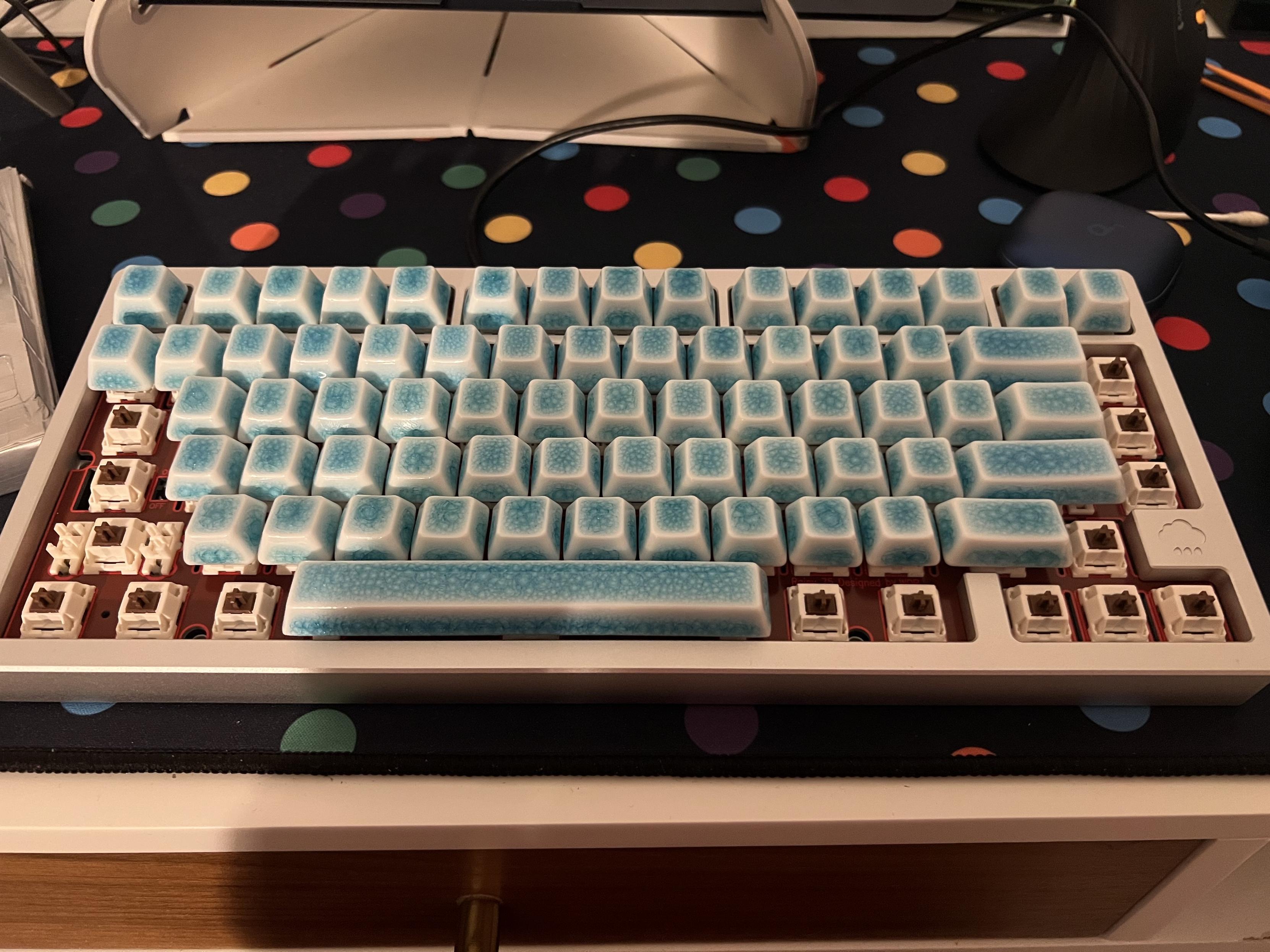
Cerakey were kind (or, crazy?) enough to supply me with a full set of blue crazed, blank keycaps. These come in three boxes labelled A, B, and C and consist of generally alphas, mods and the numpad cluster. The set is sold together, but the general idea – I gather – is that you can mix A and B sets from alternate colorways to get a two-tone look. The F keys, for example, are split between A and B to facilitate this, with F1-4 and F9-12 in the A set, and F5-9 in the B set.
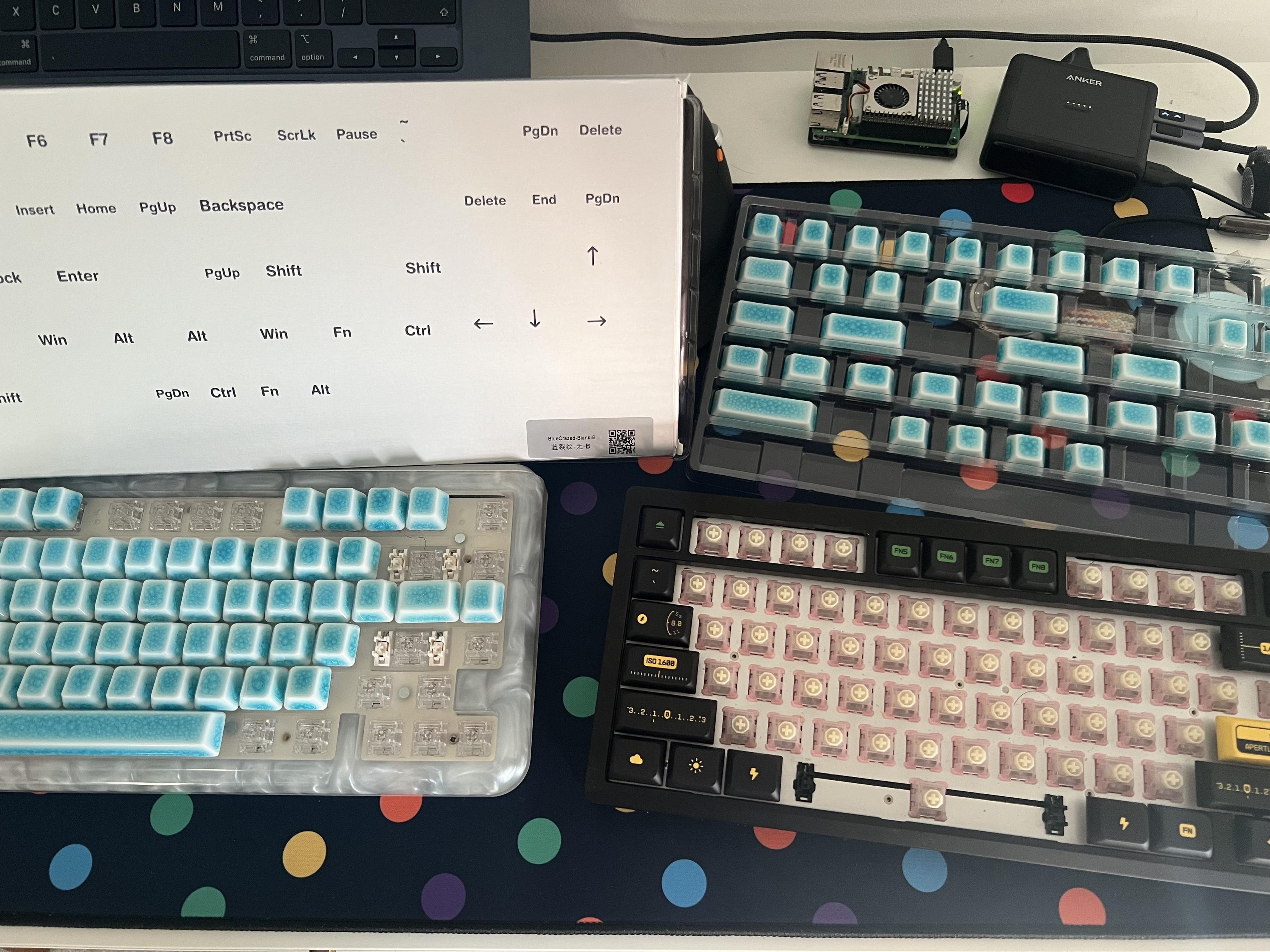
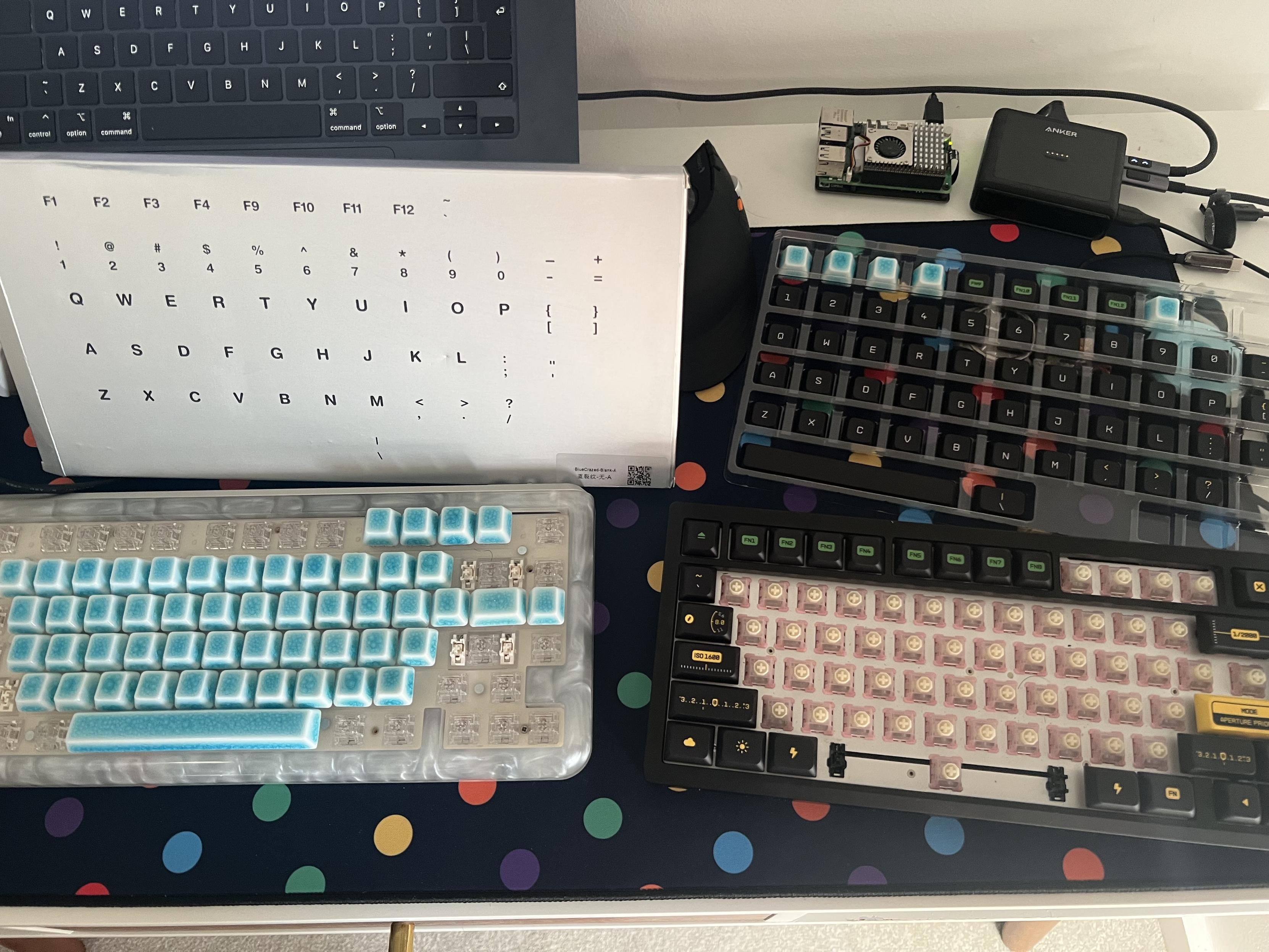
The labelling on the backs of the boxes is super, super helpful for getting the right keycap into the right place without worrying too much about which row they’re supposed to go on (it matters!)
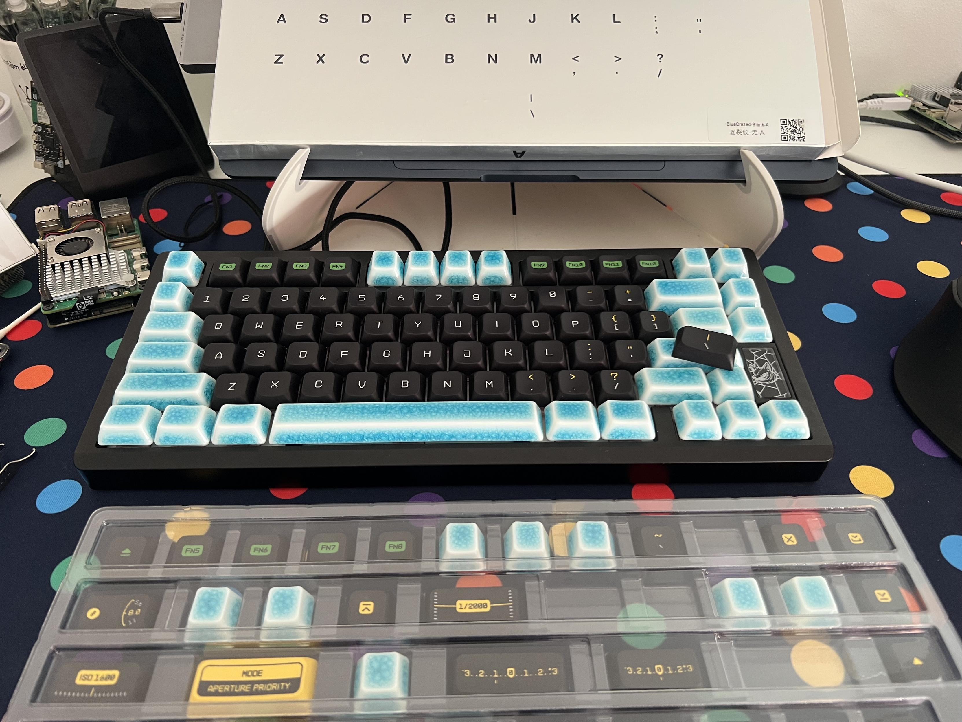
The caps are roughly Cherry Profile, which means they are non-uniform and so – despite being blank – cannot be readily placed in any row on the keyboard. To remove much of the confusion that might arise (when you’re not familiar with Cherry Profile and populating a board) the backs of the boxes are printed with a guide of which key is where in the trays.
A good hack for populating your board- assuming you’re replacing existing, legend keycaps- is to swap your existing caps into the box so you can keep track of what’s gone where and swap back if the fancy takes you.
Swapping out to blank keycaps can be a bit of a mission, but the guide on the box matching positions in the tray, and swapping the old caps into the tray, helps.
Certain keys – such as Page Up and Page Down – will have multiple choices. Of course they aren’t labelled in the blank sets so you can put them anywhere, but depending on which row your keyboard puts these keys on (75% and 68% can get weird with this) you might want one or the other. There are both 1u and 1.25u Ctrl, Fn and Alt keys, albeit only one set, and 2u, 2.5u and 3u Shift keys.
There’s no ISO enter, nor any accommodation for anything but ANSI, which is a little disappointing, but on keycaps with legends (even though the ones tested lack them) opening up the doors to ISO brings in a lot of complexity.
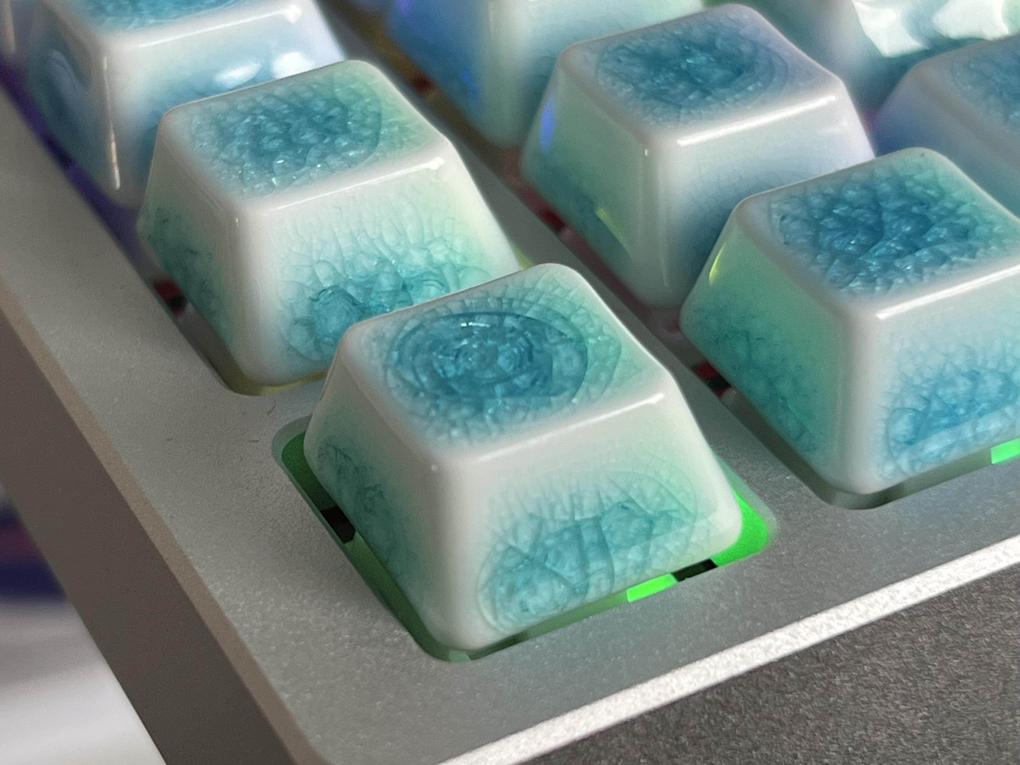
Because they’re ceramic, and as noted in my review of the Nada65, Cerakey’s crazed caps tend to be noticeably cold to the touch while typing. This can be quite pleasant or quite unpleasant depending on your environment, but you might want to have some other keycaps on standby to weather a British winter.
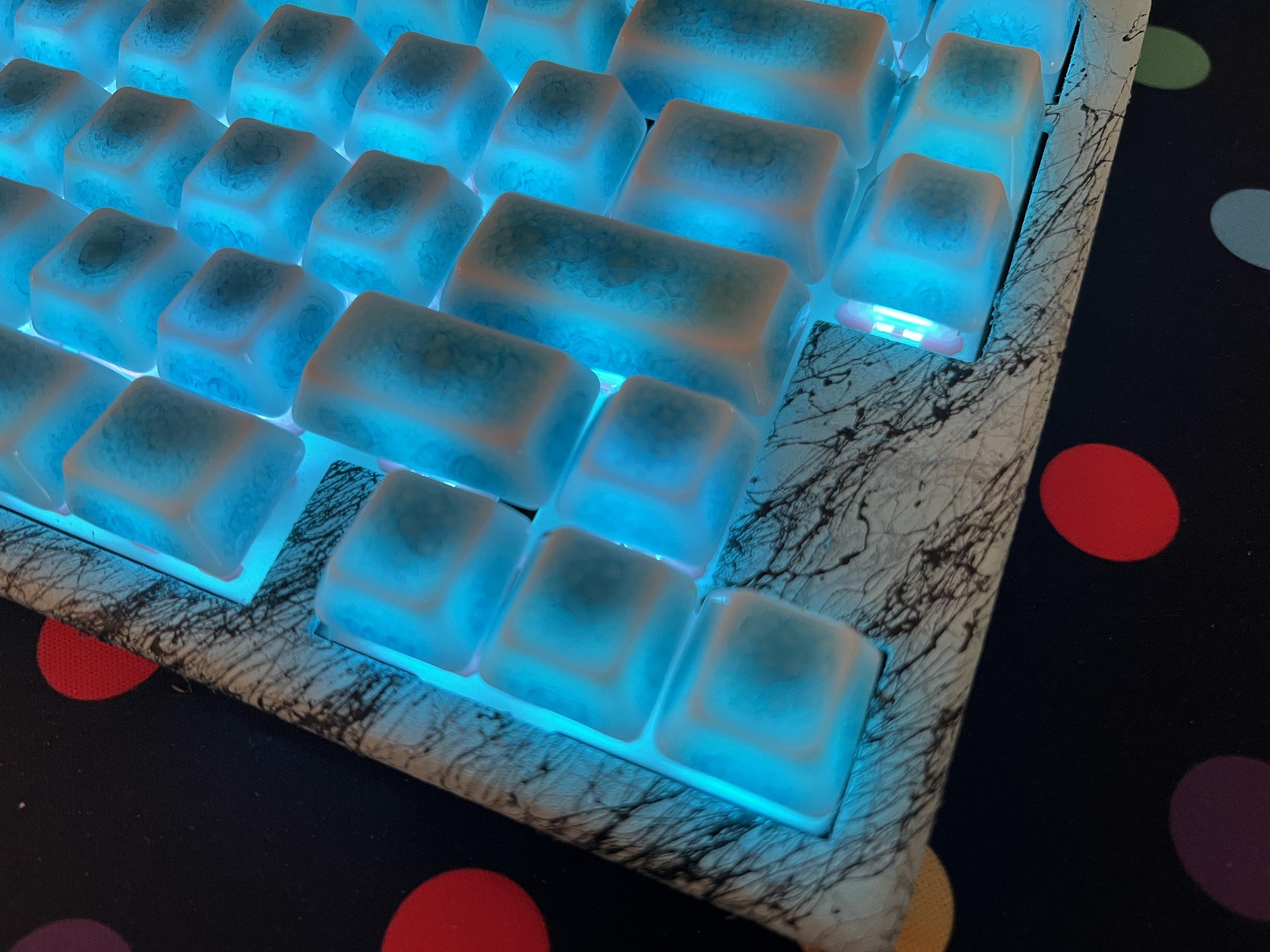
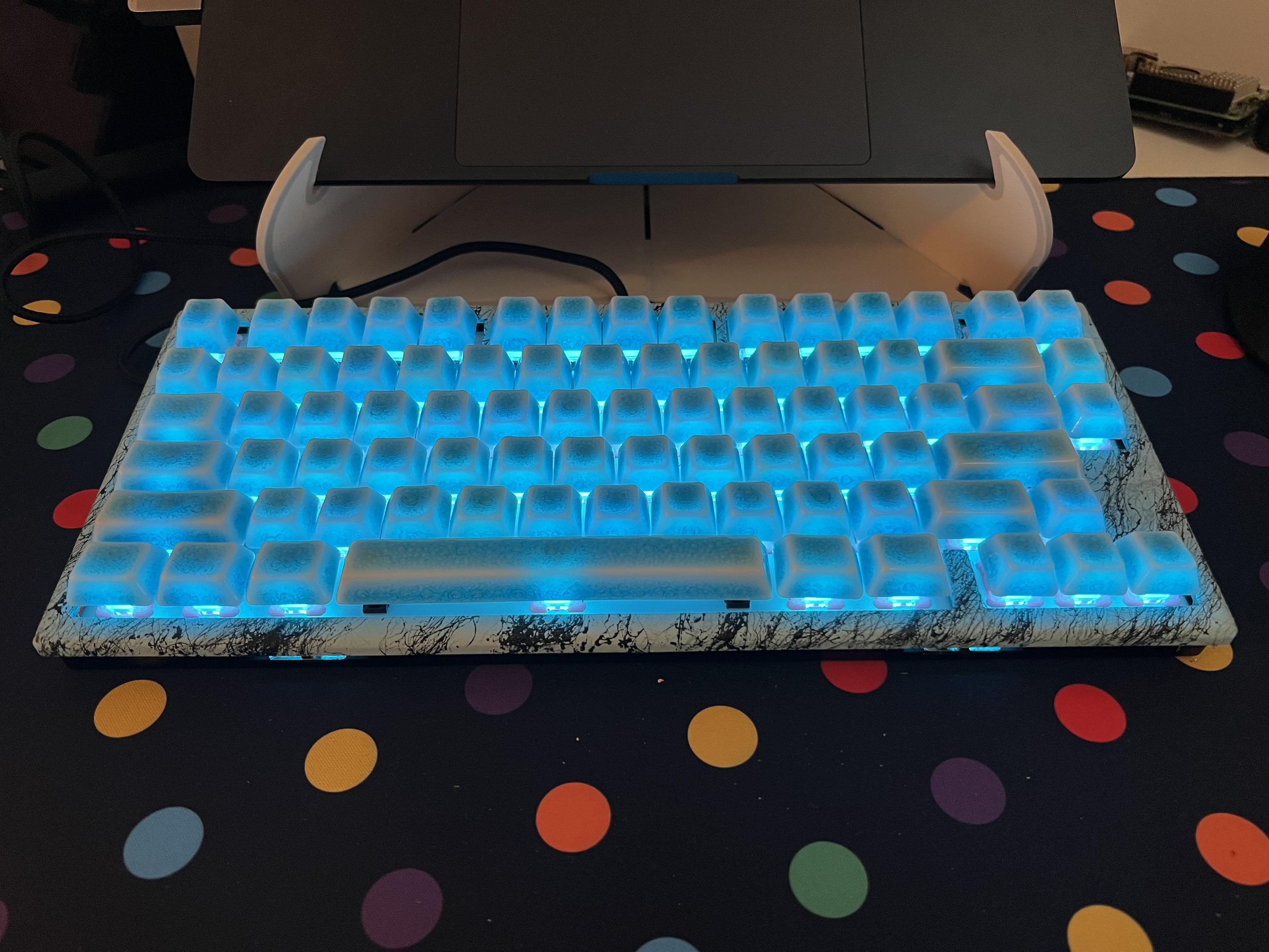
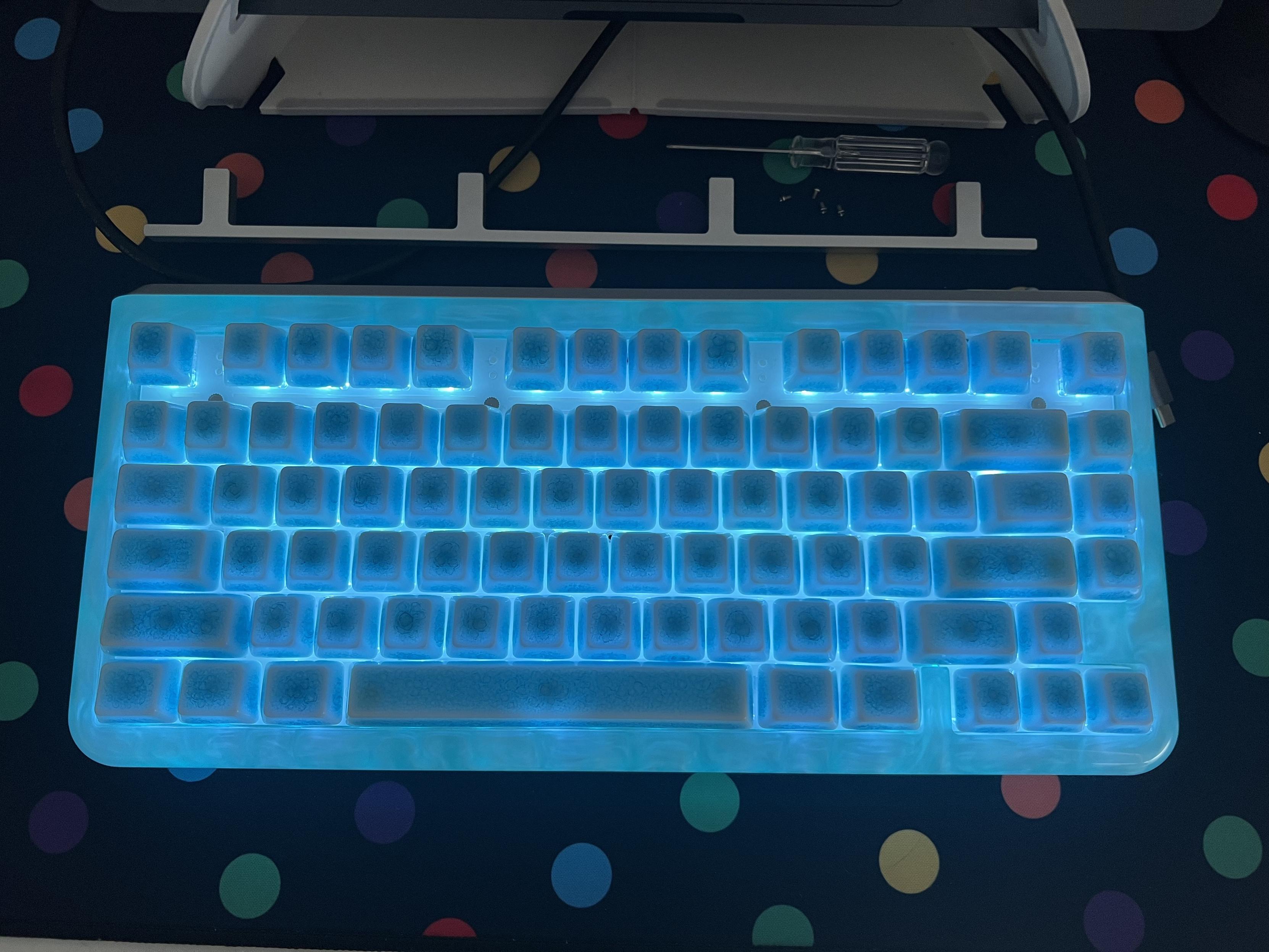
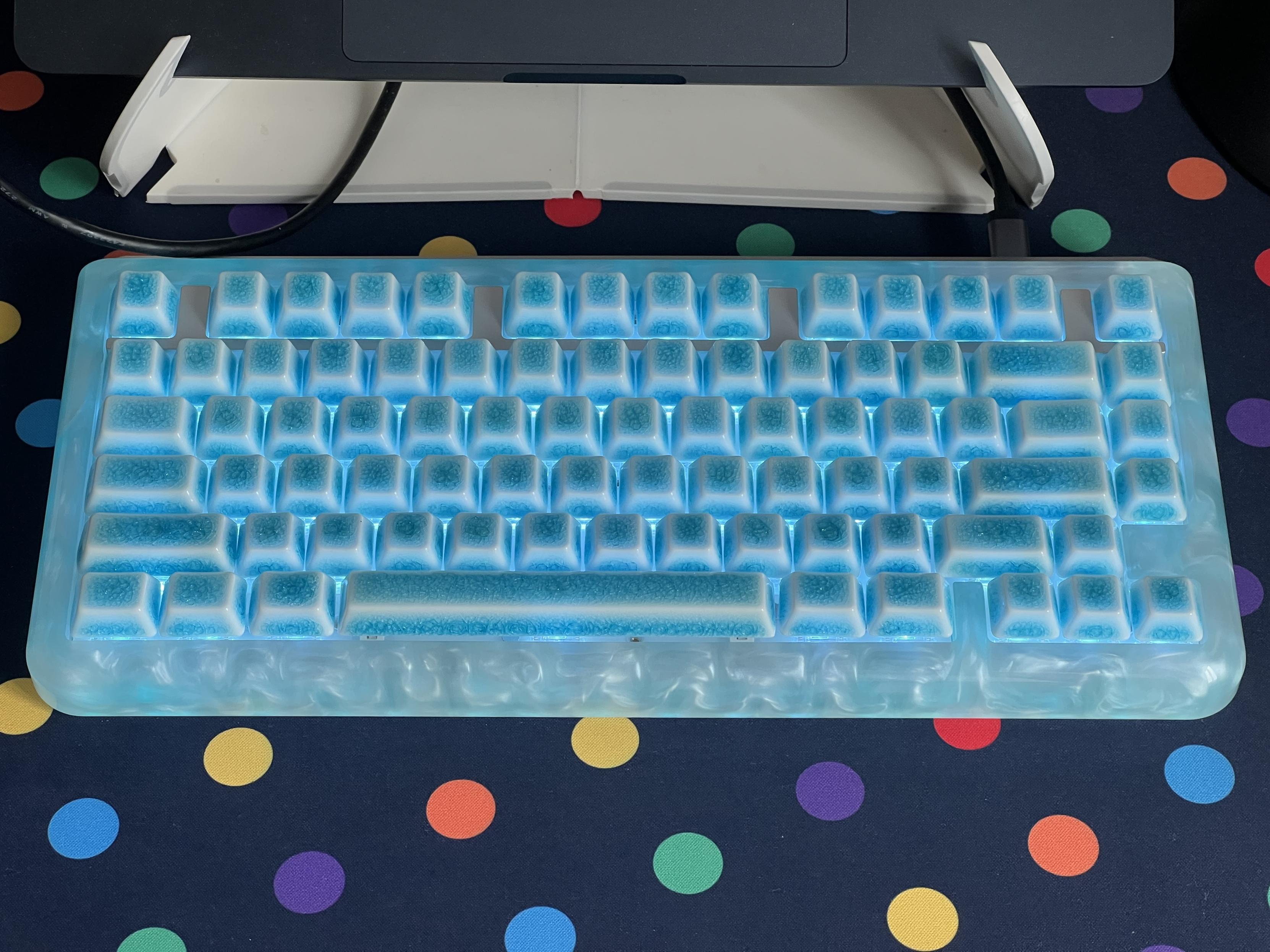
Despite being blue (albeit they are also available in white) these keycaps backlight reasonably well, illuminating almost the entire cap with a glorious, diffuse light. Only the upper outer edge, where the sides meet the top, is left a little darker, but I find this defines the tops of the keycaps nicely and prevents them getting lost in a sea of colour.
Why shouldn’t I use a concentric shatter pattern as a pseudo novelty? As a treat!
Because the “crazed” effect is achieved using a tenuously controlled process, the look of these keycaps varies a little from one to another. Most tend to take on a sort of voronoi pattern, like you might see in densely packed bubbles, but the occasional cap will take on a uniform, concentric pattern like a laminated glass window hit with a projectile. The crazing is focussed around the middle of the sides and the top, with the edges of the caps remaining white, giving their shape some delineation when not illuminated.
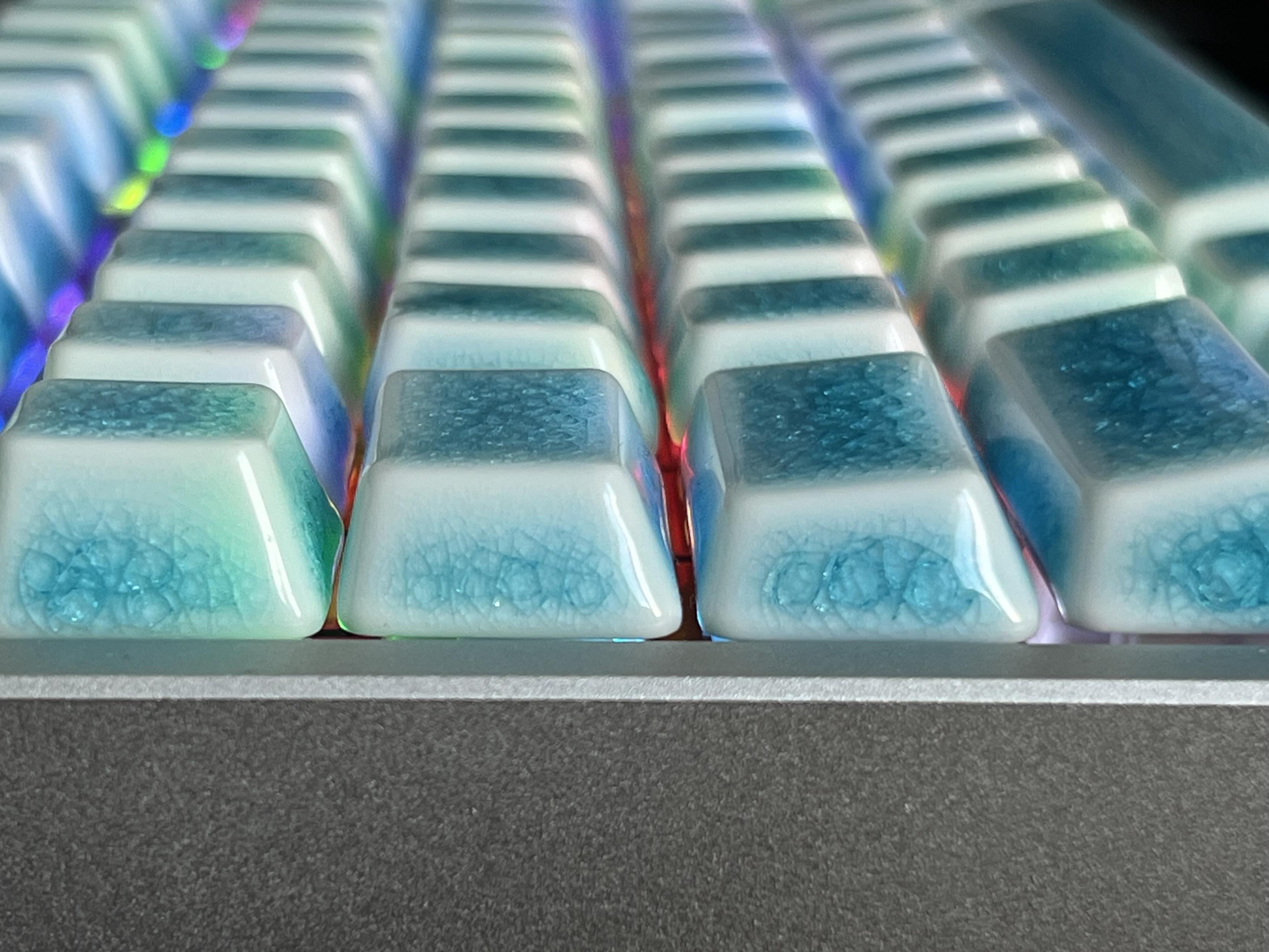
The slightly convex tops are very, very subtle, but quite delightful to type on. A rarity for keycaps, too.
One slightly curious thing about Cerakey’s ceramic caps is their convex tops. Perhaps it’s a necessary limitation of their manufacture? This is generally something most serious keycaps avoid- with profiles having a concave top with varying flavours of depth and clever geometry and reserving convex for row 1, the domain of the thumb. In this sense Cerakey’s caps, although ostensibly Cherry profile, are closer to the convex caps you might find as row 1 alternatives in well kitted sets (PBS blanks, I’m looking at you). If you like the feel of convex caps then this will be particularly compelling, since they’re hard to come by elsewhere. In addition to the concave tops, they also lack sharp edges, meaning even inaccurate finger placement lands somewhere forgiving. They are, without a doubt, a joy to type on.
Finding a board to put them on
I went through a phase of swapping Cerakeys caps onto various boards until I finally settled on a WOBKEY Rainy75 in silver. Rainy75’s “pitter patter of rain” sound profile with stock caps lend itself very well to a simple enthockening from Cerakey’s ceramics. The result is an extremely pleasing, deeply thocky keyboard with an almost open hearth fire crackle to the soundscape. Combining the cold, natural ceramic with the cold, raw look of silver anodized aluminium makes for a very aesthetic keyboard.
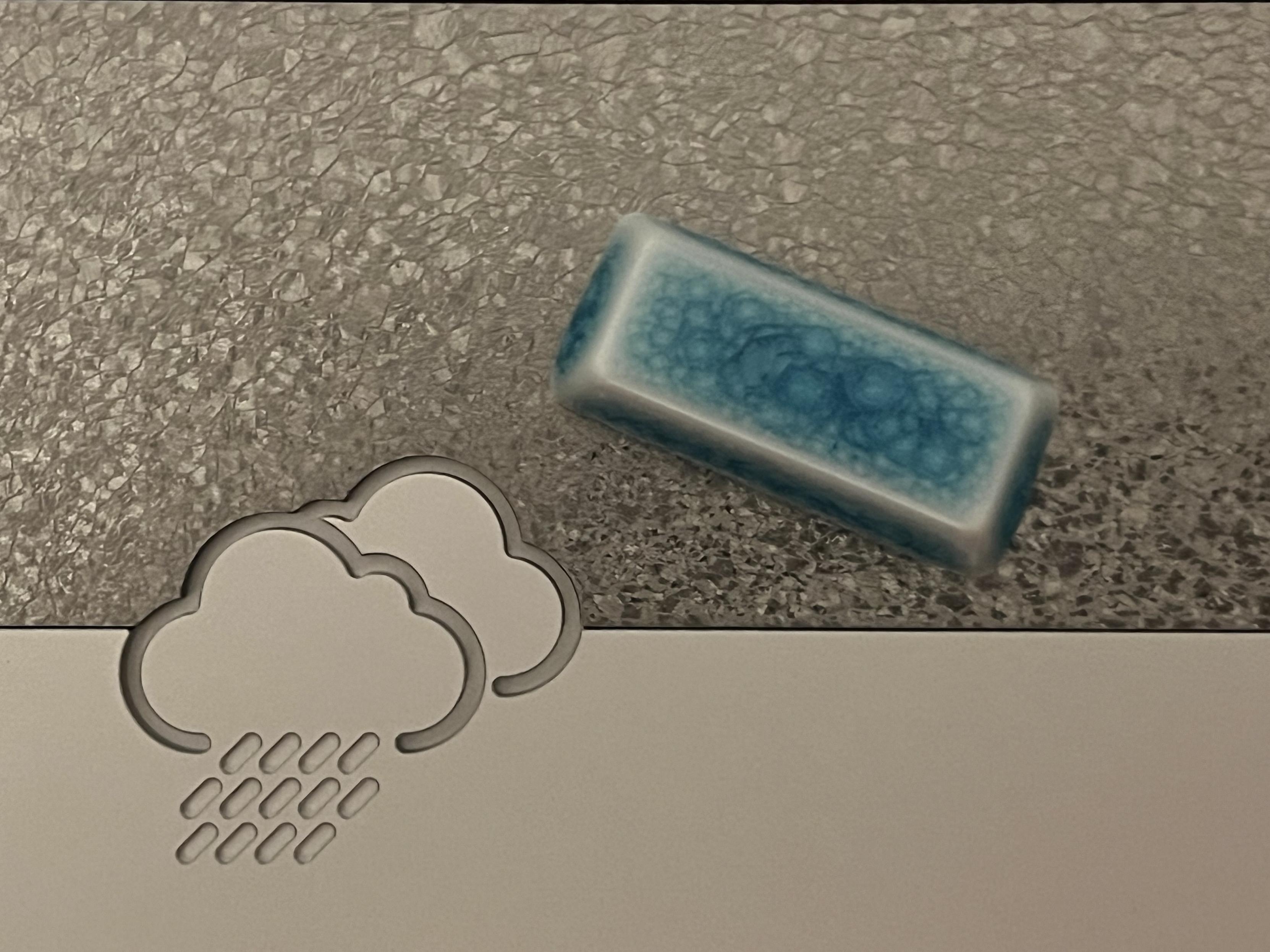
Even the (sintered milling chips?) patterned weight on the underside of Rainy75 ties in beautifully with the voronoi-like patterns of Cerakey’s crazed ceramic caps.
This is either helped or hindered by just how much these crazed ceramic keycaps pop when backlit.
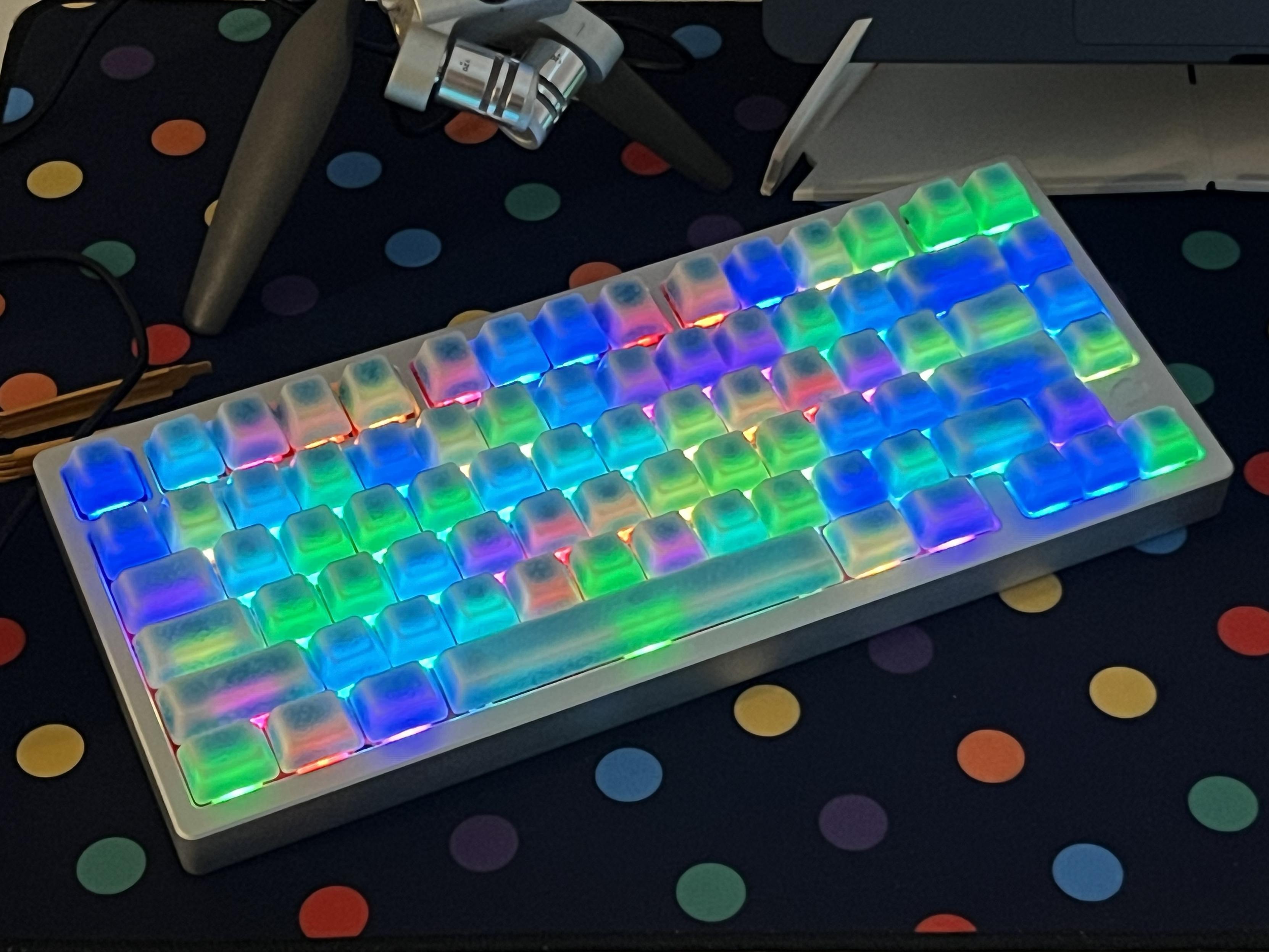
Despite being blue, these absolutely pop when backlit. Need more spacebar LEDs though.
Before this I tried them on Chilkey’s Slice75 where they were a bit of a tonal mismatch with the black anodised finish. I experimented with a custom 3D printed top, sprayed blue and given a marble effect finish which helped tie in the caps better. The result was quite effective – to the point where someone wanted to commission me to recreate it – but without a 3D printer large enough (hey, Bambu, I’m side-eying you right now) to print the whole keyboard top in one shot, it wasn’t something I could pull off.
A custom printed and painted top shell helped me blend the caps in somewhat, with not entirely terrible results. Doesn’t hold up outside of photos though.
KiiBOOM’s resin Jade75 was another candidate, and – in the dark when lit up – they tied in really well with the Jade75’s bizarre, cast resin colour.
Superfluous aluminium trim, who needs it! Unfortunately this was screwed into the plate and a bit of a pain to remove.
Overall
Cerakey’s crazed caps really sold me, in the way that their Panda style boards on the NADA65 never quite managed. I’d say the crazed effect has made me much, much more amenable to glossy caps, though I’m happy to report that Cerakey have also started making matte ceramic keycaps, though I’m still waiting for some blank versions.
If you’ve just picked up a Rainy75, or a similar plain aluminium keyboard (ANSI only, sorry ISO users… ) then I would heartily recommend, no, encourage you to pick up a set of Cerakey’s crazed caps. It’s an absolutely killer combination, and I think it’s likely to be one of my mainstays for a while.
If I were to wish for anything from Cerakey, it would be low profile, uniform ceramic keycaps to give much more flexibility over where the various patterns and effects can be placed. Did I want one particular, concentric circle crazed keycap to pose as a novelty escape key? Yes. Was it a row 4 numeric key with a matching shape? Yes. Did I get lucky? Also yes. But the patterns are about as random as you can get, so that luck might not extend to your set. I realise uniform profile, blank keycaps are probably not the easiest sell but hey it’s my wish!
Cerakey took rather a different turn, though, and followed up their glossy, crazed and matte keycaps with lacquered ones in seven different colours. I’m normally a big fan of simple block colours and minimalism but something about these appeals to me, I hope they become generally available soon.
In short, Cerakey are the titans of thock, making caps that elevate the sound of a good keyboard to greatness. The Rainy75 I’m finishing this review on really cements that, and the fact that it supplanted a Zoom63 V3 with my beloved PBS blank caps should speak volumes. But don’t take my word for it- hit up my Soundcloud for a listen to Cerkey’s sublime, fireplace crackle.