JSAUX FlipGo Lite 15.6″ Portable Dual Monitor Review
I had been chasing JSAUX for a FlipGo since they launched their 13 and 16 inch variants on Kickstarter. With a sum total of one portable monitor review under my belt I was keen to try more. It wasn’t until I’d forgotten about it that they popped up out of the blue and asked if I would “recommend” their FlipGo Lite.
You know what? Yes. Yes I would recommend the FlipGo Lite. I told them as much, and they were happy to supply me with one for this review. In this review I’ll be talking about the 15.6” FlipGo Lite which is available at time of writing for $299.
I had pretty mixed expectations. On one hand JSAUX have been pretty good, generally producing some decent phone and Steam Deck accessories. On the other… my prior experience with portable monitors – the Crowview – was not great.
It’s primo, and this is the *Lite* one! (It’s … not light)
My scepticism was quickly assuaged when I received and open the FlipGo Lite, however, since despite being ostensibly the low end of JSAUX’s portable monitor range it’s… really quite fabulously well put together, and beautifully presented.
Not so bright
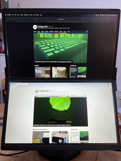
But it’s the budget option and it isn’t without its flaws. Well, flaw. And that’s brightness. On paper the FlipGo lite’s 250 nit brightness looks shockingly low. Compared to others in its range it’s anywhere from 50% to 60% the brightness. And it shows. These displays are very, very dim and don’t lend themselves well to prolonged use or bright environments. A dingy coffee shop might be just the trick, but my bright and breezy kitchen leaves my eyes straining to see what’s on screen. This is mitigated somewhat by avoiding dark mode apps, but since those are my bread and butter it’s quite the compromise.
Light mode vs dark mode, choose your weapon!
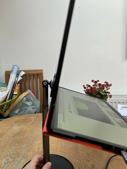
Another downside of the panels is the viewing angle. While it’s generally pretty good you do lose some brightness, and when you don’t have much to start with that can be a real nuisance. I found the best way to combat this was to fold the FlipGo about 5 to 10 degrees or so such that the bottom screen is facing slightly upwards. On a table – using the optional Snap Stand at its full extent – the top screen is roughly level with my eyeline and brightness is good. The bottom one, without a little upwards tilt, is noticeably darker. It’s fortunate, then, that FlipGo offers the flexibility to fix this and it’s actually pretty easy to get a comfortable multi-monitor setup and the top screen is in a much, much better position than my laptop sat flat upon the table..
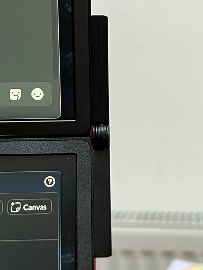
Outboard hinges are a hell of a choice but … they really work!
Aside from the dim displays there’s not a lick of backlight bleed or any serious display quality issues I can identify. My usual suite of basic monitor tests – those from lagom.nl – show a little gradient banding and detail lost in darker colours, but these are somewhat expected. The TLDR, don’t watch dark moody videos on FlipGo. Stick to Wes Anderson and One Piece episodes or… y’know… word documents and business stuff.
Build Quality
Brightness, or lack thereof, aside the FlipGo Lite – I tested the 15.6” model, since it’s roughly the size of my laptop – is surprisingly well built. The two panels are joined by an almost invisible flex cable that runs between them roughly in the middle. This is noticeably different from common laptop arrangements, since it’s not running through the hinge. And it couldn’t; the hinges are mounted on the extreme sides of the panels, actually protruding out from the sides of the FlipGo. This seems to keep everything nice and slim – in fact I could squeeze the FlipGo into my bag along with my laptop no problem – without compromising on the quality of the hinges. Quality seems to be the name of the game. The FlipGo Lite – despite being the low end of the range – is quite expensive, but it never feels like compromises have been made in service of penny pinching… uh… panel brightness notwithstanding.
The two panels are set within metal frames that don’t have an ounce of twist, give or flex in them. This is a bold choice for something portable, to which the Lite probably owes much of its 1.5kg weight. But, good grief, does it feel slick. The front of the frame has a noticeably contrasting plastic bezel which is a little jarring, but everything is clean, black and pristine- JSAUX haven’t even seen fit to mar the front with a logo. It took even Apple years to stop doing that to MacBooks. The lower back of the bottom screen is also plastic- thankfully- or this thing would have been far, far too heavy.
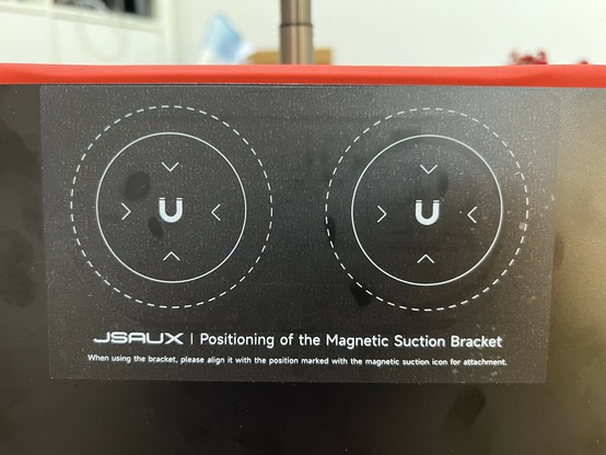
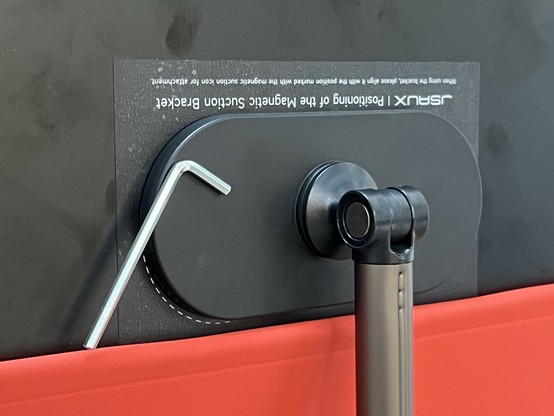
Magnets, how do they work?
Suction apparently…
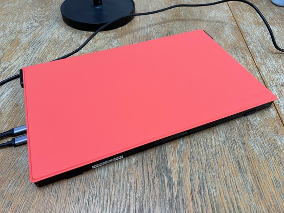
When closed the FlipGo Lite looks and feels like an expensive laptop and it’s a little bit thicker than my 15” MacBook Air. The ability to close the FlipGo and keep both screens protected from the random junk in your bag is by far its strongest feature- well aside from having two 1080p screens- and there’s even a nice magnetically-attached red/orange flip cover to keep it further protected. Or, more likely, protect other things in your back from it.
The magnet also provides a handy place to keep the Allen key 🤣 (helpful to tighten the top joint or disassemble the stand for transport)
Beneath the flip cover is another sticker detailing the location of the two magnet arrays which allow the FlipGo to be fixed to all manner of accessories. I got my hands on a stand – which somehow holds the whole monitor assembly upright and clear of the desk, but isn’t very portable. I also tested their VESA mount, which adapts a regular VESA (well, ostensibly anyway, I had trouble with the bolts) monitor mount arm to magnetically attach the FlipGo.
IO, IO
As if two monitors and impressive build quality wasn’t enough, the FlipGo Lite also brings full USB Type-C hub and pass-through charging functionality to the table. This is enormously useful, since you need only pack one Type-C charger for your laptop (which plugs into the FlipGo) and a simple USB Type-C to Type-C cable to connect your laptop to the monitors. It’s also extra useful for computers like the MacBook Air, which stubbornly lack even a single USB Type-A port. The FlipGo has two, so plugging in wireless keyboard dongles or USB cables for whatever microcontroller I’m programming at the time is easy.
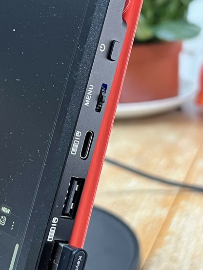
Respect the rocker switch!
Joining those two USB A ports on the right-hand edge of the FlipGo are a USB Type-C you can also use for downstream peripherals (helpfully labelled with a mouse and keyboard icon), the power button, and – possibly my favourite not-quite-a-feature – a classic rocker switch to access the on-screen menu. The rocker is a great choice here, since it gives you up/down and enter in one single control (you push it to enter, though pushing can be a little unresponsive) and then the power button, which is directly above it, serves to exit out of whatever control you’re in.
To complete the absurd level of control overloading here, the power button also doubles as a quick select for the input. Press it once and it will give you the option to switch between Type-C and HDMI, which you can accomplish with the rocker. Move the rocker without pressing it, and you’ll control brightness directly without digging into the OSD- though you’ll probably always want it at 100%.
The OSD has a pretty minimal set of options including Brightness, Contrast and Black Level and “DCR” which makes those all automatic. It also has a Sharpness option which does have a subtle but visible effect- on my MacBook all the text is pretty soft at 1080p with no scaling, so I crank the sharpness up to 4 and it all looks that little bit crisper.
There are also colour temp options, plus separate Hue and Saturation adjustments you’ll probably never touch. What you might touch is the Low Blue Light option which warms up your display (tinting everything yellow-ish) for healthier nighttime viewing. Useful if your OS can’t do this natively.
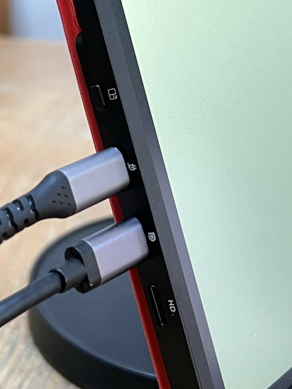
More ports, mostly because it doesn’t feel right leaving big gaps in my review without images…
That button switches from Ultraview (one 1920x2160 screen for macOS) and Duo view (two displays using DisplayPort MST) by the way.
On the left-hand edge of the bottom screen are the power connection, the USB Type-C (DisplayPort) connection and the mini HDMI port. These are joined by another button which gives a one-touch means to swap between Duo and UltraView modes…
U…U…U…UltraView
On the topic of operating systems, did I mention I’m using a MacBook Air? If you’re familiar with their limitations you might rightfully be wondering how I’m running two monitors through a single cable on a laptop that refuses to acknowledge the existence of DisplayPort MST. The simple answer is: I’m not. JSAUX integrated something called UltraView mode which glues the two 1080p screens together into a single 1920×2160 pixel display. This means it presents as one display to macOS and just works. Or, mostly, anyway. The big issue with a single display with two lots of screen bezel between its halves is that windows spanning the whole screen look a little off. To get back the feel of having two separate monitors connected I installed “Rectangle”, a free and open-source app for window-snapping. With a generous 24 pixel “Gaps between windows” configured I could snap one window to the top and one window to the bottom and have Discord and Slack tucked away, but glanceable on the FlipGo. WIthout this 24pixel gap Rectangle would consider the macOS Dock as not part of the monitor and a 50% top/bottom snap would extend past the screen boundary just slightly.
In Duo mode the limits of the MacBook Air are shown up quickly, rather than two monitors you’ll just get two copies of the same screen. This is standard issue shenanigans when it comes to macOS and DisplayPort’s “Multi-stream Transport” technology.
Overall
The question posed to me by JSAUX – or their marketeers anyway – when they offered me a FlipGo to try was: “Would you recommend the FlipGo as one of the best portable monitors in the market?” Well, I’ve got one problem with that- FlipGo is only the second such monitor I’ve tested and perhaps (if you include the NexDock and the janky custom panel in an acrylic laser cut case I’ve used) the fourth I’ve used. I don’t have the frame of reference to know if FlipGo Lite is one of the best, but I can say: it’s pretty darn likely. Either way I’d certainly recommend it.
The ultimate test of hinge goodliness… y’know other than the heavy bottom panel managing to hinge upwards against its own weight when held from the top one…
The uncompromising build quality, well considered controls, sleek good looks and hacks-for-your-Mac come together to make the FlipGo Lite not only good enough to forgive its low 250 nit brightness, but so good that I’ll find excuses to use it. I don’t think you’ll catch me in a coffee shop with it anytime soon, but I do take it with me to work (a two hour commute up north!) because I’ve somehow got away with not travelling up often enough to warrant my own desk and permanent monitor setup.
If you can live with a little dim and a little heavy then the FlipGo is a great choice and if it’s not one of the best… then darn I want to try whatever is!
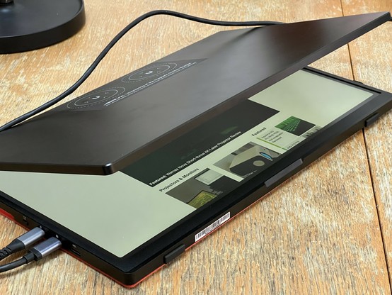
Those hinges are wild…
The stand can’t even take the weight, but the hinges can 🤣🤣🤣
