Epomaker x Feker Galaxy 80 Review
“Muum, I want DSA LightCycle.”
Mum: “We have DSA LightCycle at home…”
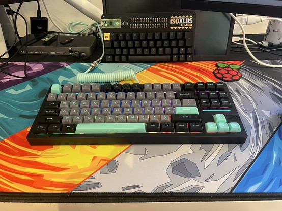
DSA LightCycle at home:
Epomaker sent me their teal “upgrade cable” so I could properly complete this look. I am not disappointed! Though my cable management still needs work 🤣🤣
This is the Epomaker x Feker Galaxy 80 in black. As you can probably guess I was lured in by the glorious neon teal. A glorious neon teal that was familiar to at least one Discord keyboard enthusiast, who recognised it as being similar to DSA LightCycle.
With not so subtle inspirations from Tron, DSA LightCycle was a Group Buy doubleshot ABS keycap set sold in the distant, ancient past of September 2016. Fast-forward a few years and we have the Epomaker x Feker Galaxy 80’s “black” colourway which, I think it’s fair to say, has keycaps that take some not so subtle inspiration from DSA LightCycle.
And I’m conflicted about this.
I wasn’t interested in mech keyboards back in 2016. I’m also not that interested in group buys; I don’t have much of a head for taking financial risks, and I have even less patience when it comes to attaining shiny new things. I also… let’s face it… am averse to spending a small fortune on keycaps. Uh let’s just pretend I don’t have KAM Superuser sets…. As such, this heavily inspired take on a classic keycap set – that would very much have appealed to me were it available and cheap – is an opportunity for me, and others dipping a toe into the hobby to have nice things, too.
So, wearing my customer hat for a moment, the idea of picking up the gorgeous Epomaker x Feker Galaxy 80 (I won’t mince words, this board looks ace) – for less than the cost of the set it was inspired by – is very, very compelling.
Wearing my designer hat. Well I’m not sure if I would be indifferent to a years-later set being heavily inspired by my work, if I would be flattered by this imitation, or if I would be offended that the likes of Epomaker or Feker just can’t seem to match the quality and elegance of premium keycap font choices and weights.
While their choice of inelegant font may be more to do with the limitations of cheaper, less precise doubleshot keycap production I can’t really fault the caps on the Galaxy 80 otherwise. They carry a similar low profile to DSA, albeit are far more sculpted and varied across rows. As such they work quite nicely on low profile keyboards, but I don’t have a low profile 80% board to steal them over to. And the Galaxy 80 is probably too nice to steal keycaps from.
With the lede thoroughly unburied, let’s get into a bit more detail about why this – of all boards – stands far above everything else I’ve tried from Epomaker so far.
VIA B Gone, Everything B Gone?
I’ve tested so many definitely-not-QMK-we-promise, VIA-compatible boards from Epomaker that I charged into the Galaxy 80 expecting it to be the same. It’s not. The Galaxy 80 is a tri-mode board with proprietary firmware and very few frills compared to the typical Epomaker keyboard. In fact at this point I’m convinced Epomaker is run by a genetic algorithm that scores its outputs on customer feedback and is slowly, but surely, homing in on something really spectacular.
For the impossibly cheap $105 the Galaxy 80 costs to buy, you get that aforementioned tri-mode, and a full flex-cut, hot-swappable PCB inside at least a kilogram of solid, hefty aluminium frame. While it isn’t perfect – the logo and badge on the bottom are plastic and don’t fit into the recess machined for them – it’s one heck of a lot of board for the price.
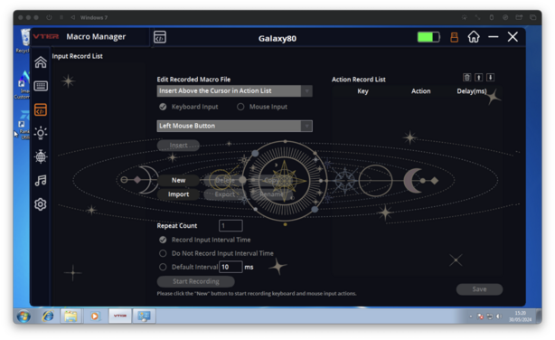
The Galaxy 80 software is functional but looks very much like how you'd expect keyboard software to look... circa 2010.
Perhaps some of the reason for this low price is the lack of frills. There’s no extraneous LCD on this keyboard. No rotary encoder or knob. There are, of course, RGB LEDs absolutely everywhere, but apart from this it’s all business. I appreciate this, I’ve complained that LCD screens are near useless, with impossible to set, unnecessary clocks, cluttered chaotic UIs, and custom image editing software that was pilfered from the 2000s. There’s a lot to be said for just throwing LCDs away and keeping things streamlined.
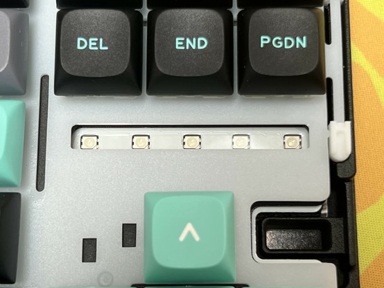
In lieu of indicator LEDs or an LCD the Galaxy 80 has a light bar across the top surface of the board, running beneath Del, End and PgDn. I’ve complained similarly hard about extraneous lights, but in this case it serves a purpose. The light bar will flash various colours to indicate wireless mode. It does this in lieu of lighting the corresponding keys on the keyboard, side-stepping issues (in both Epomaker and Keychron boards) I’ve seen before where re-mapping controls does not re-map their corresponding indicator LEDs.
Gooey Innards
None of my mad rambles about keyboards would be complete without opening ‘er up, so let’s explore the Galaxy 80.
First up, every screw has a little adhesive rubber blanking cap that needs to be peeled off. I’m not sure this was a worthwhile effort, since nobody is looking at the bottom of a keyboard, but it does make the Galaxy 80 feel that tiny bit more premium. Prying them out required the pointy end of iFixit’s spudger and was a little fiddly, but they did still stick back in after reassembling the board. That said, one had fallen out into the packaging when the board arrived.
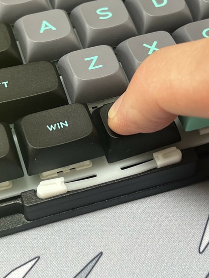
The plate in the Galaxy 80 is suspended by little sproingy bits.
With the screws removed, the top chassis lifts off and reveals the plate and PCB. These are, in turn, suspended by elegant little cantilever assemblies with isolating pads which allow the plate and PCB to spring up and down somewhat in the case.
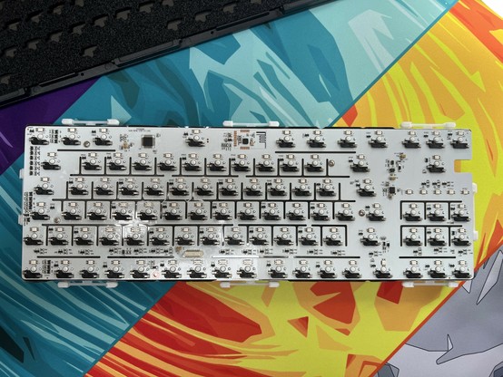
The PCB is flex cut, which effectively means it has slots milled into it which increase its top to bottom flexibility. I’m not convinced it makes a world of difference, but I am a little bit in awe of the extra effort it requires to route traces around these impassable barriers.
I’m not totally convinced by flex cut PCBs but I’ve got to admire the dedication it must have taken to route this thing!
The keyboard is powered by a large, 4000mAh battery. It’s a different shape to what I’m used to digging out of Epomaker keyboards, and it’s connected via a JST connector to the switch and USB Type-C port daughter board. This board, in turn, is connected to the main PCB by a ribbon cable. This setup makes it easy to disconnect both battery and USB from the PCB when disassembling the keyboard. One plug. Tidy.
Between the PCB and battery (and the bottom chassis) is a thick layer of low density foam and a PET plastic insulating layer. Between these, the PCB, and the three layers separating it from the plate there are a total of seven material layers inside the keyboard. How much this has to do with the resulting sound of the Galaxy 80 is completely beyond my understanding, but the Galaxy 80 does sound nice. Really nice.
Sound And Feel
The Galaxy 80’s layers upon layers of padding, flex-cut PCB and solid – to the point of absurdity – aluminium chassis make for a board that’s – oh dear I’ve chugged the milkshake – very noticeably crisp in its sound profile versus other boards I’ve tried to date.
The sound profile is much like the KiBOOM Phantom, but the Galaxy 80’s reserved, clean look appeals to me in a way I’m struggling to put into words. I think the teal, black and grey keycaps – the aforementioned “DSA LightCycle at home” – speak to my personal sense of aesthetic in a profound way that’s probably not generalisable. If I had tried any other colour, I don’t think I’d have liked it as much as I do – which is an awful, awful lot – but it would have been the same keyboard, with the same heft and the same crisp, precise typing sound.
I guess feel wasn’t supposed to mean how I felt about this board, but it feels very much like I’ve captured some of the magic of sinking a small fortune into a glorious custom board, and custom keycaps, but with something that costs – I’m almost afraid to admit – roughly half what I spent on my first set of premium keycaps.
South-facing LEDs, and I don’t hate them?
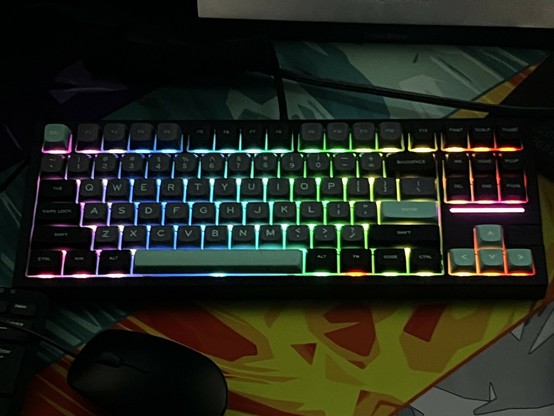
Perhaps one of the biggest contributors to my love of this board is the lighting. I never thought I’d see the day when I wasn’t outright confused by south-facing LEDs, but life comes at you fast. I’m learning. I’m embracing.
In the case of the Galaxy 80, the issues I had with the Shadow X and less so with the Shadow S – namely either a direct line of sight to the backlight LEDs through the keyboard, or very obvious hot-spots in the lighting – have been all but solved. The LEDs in the Galaxy 80 seem set far enough down as to be near impossible to glimpse directly. If you get the angle just right you can sort of see a little glint around the plastic clips of the white switches. The upshot of this positioning is that most of the light you see from the top of the keyboard is very heavily diffused through the plastic plate which holds the switches steady.
I’m still conflicted about top-mounted LED features, but the Galaxy 80 light bar doesn’t offend me!
The resulting lighting effect is remarkably consistent. While it still has the ebb and flow of hotspots, these are usually concealed behind a key with the exception of the very front row.
Even the light bar- which at least isn’t completely superfluous here – has enough presence to not look out of place.
Dongle Go Sproing
While I think I’ll inevitably use this board in wired mode, it’s hiding tri-mode functionality behind hotkeys and a dongle behind a little magnetic face-plate.
The face plate is both simple and remarkably clever, since it slides off easily and the dongle pops right up out of its little recess. Spring? No, the dongle is simply leaping up to attach to a magnet just below the aluminium top chassis. It’s an elegant little solution that presents the top of the dongle for easy removal, but involves no mechanical or wear parts in the process. I can’t stop playing with it, ha!
In wireless mode (the keyboard switch in the On position) you’ll find the standard Fn plus Q, W or E combo handles Bluetooth, and Fn + R switches to 2.4GHz. Q, W and E light up the light-bar Blue, Green and Red in turn, and R lights it Yellow. Holding down Fn plus one of the Bluetooth profile keys switches into pairing mode. All very simple and relatively easy to discover – assuming you’re familiar with these common key defaults and stumble onto Fn+R by sheer luck – without needing a three-position switch, knob or otherwise.
While wireless functionality is a nice to have, and the Galaxy 80 really steps up the dongle storage game (which makes me wonder which keyboard they borrowed this idea from), you’d be robbing yourself of the opportunity to use some excessively shiny coiled USB cables.
Overall
Epomaker and Feker (curses I can’t get Father Ted out of my head every time I read or write that) have created a board that represents, to me – in all my keyboard naivety – an accessible on-ramp into the world of mech keyboards. It’s not perfect, but for the price it is simply phenomenal value.
Lighting around the edge of the keys seems disingenuous but it’s at least super super consistent and nice on the Galaxy 80!
You might find the lack of physical switches for connection mode confusing. You might find the low-profile, sculpted key-caps strange if you’ve got any existing mech experience or strong opinions. You might miss VIA compatibility, which seems to be available on more or less anything else these days. The fact it’s ANSI and not ISO UK might be absolutely unforgivable. But in spite – and in the case of the low profile caps because – of all this, the Galaxy 80 is possibly my favourite keyboard to date.
This keyboard is absolutely a daily driver for me. It’s also perhaps the first that I’ve looked at and thought “ah, I’m not changing a darn thing about this. It’s perfect. No notes.”
More like this, please, Epomaker.
