KiiBOOM Phantom 98 Transparent Mech Keyboard Review
Every once in a while I test something that just floors me. Without mincing words, the KiiBOOM Phantom 98 is one of those somethings.
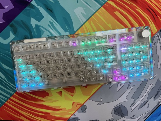
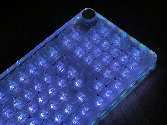
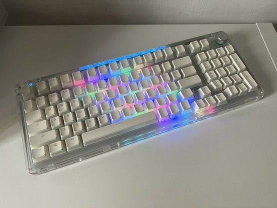
Let’s get the elephant out of the room- transparent cases are a love-it/hate-it enough proposition without the sheer, unadulterated commitment to the bit that KiiBOOM display in their products. The Phantom 98 is a 2kg jar of transparent Marmite with almost 150 bright RGB LEDs exploding out of it. You will either reel back in horror from this monster or be spellbound.
This thing does like to refuse to be all lit up when I photograph it 🤣
If you’re a child of the 80s or 90s then you probably lived through and have fond memories of the everything-is-transparent era. Whether it was the iMac G3, or the Crystal Edition Xbox, you probably also had an opinion. If you remember those products with nostalgic fondness then you’ll love the KiiBOOM Phantom 98. Otherwise? You might want to give this one a pass.
That said, I exist in some kind of Shrodinger’s love/hate relationship with transparent shells. I had a transparent Gameboy Advance, but it wouldn’t have been my first choice. I loved the dirt-showcase Apple A1048 keyboard, even if it did need very frequent cleaning. Other than those, I have never been especially fond of transparent shells and prefer to hide the gooey innards in favour of a more minimalist approach.
KiiBOOM’s transparent aesthetic is pretty much the polar opposite of this, and yet I find it absolutely captivating. Why? I suspect it has a lot to do with the incredible level of finesse KiiBOOM display in their design. Often a transparent shell is an afterthought to an existing product, showing off the fairly utilitarian internals. The Phantom 98 is designed from the inside out to be an absolutely impeccable display of the craft. Every screw is a feature, the PCB is a piece of functional art, and KiiBOOM have opted to conceal anything you might otherwise find unsightly.
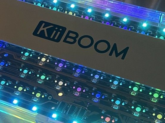
That is to say the battery – two 4000mAh LiPo packs – is cleverly hidden beneath the KiiBOOM-logo’d aluminium weight. This weight, or at least it’s styled to look like one, is probably more a name-badge, since the keyboard is more than heavy enough without it. In fact this is the heftiest keyboard I’ve tested to date and between the sheer weight and the transparent keys seeming somehow bigger than their opaque counterparts it’s quite an imposing keyboard.
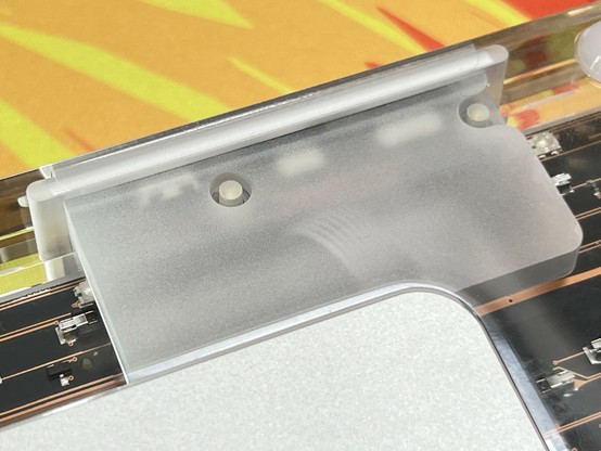
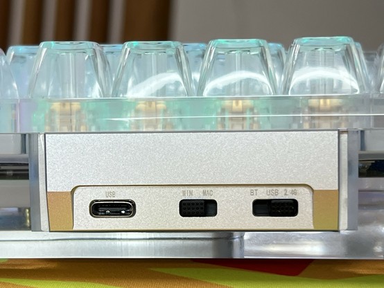
The USB and mode switch daughter board is quite nicely concealed but you can still see some ribbon peeking through. #MechanicalKeyboard
The USB Type-C port and switches are connected via a ribbon cable that’s also hidden beneath a frosted layer inside the acrylic shell. This daughter-PCB design is what allows the main PCB some freedom to bounce around inside the case and help dampen the switch sound.
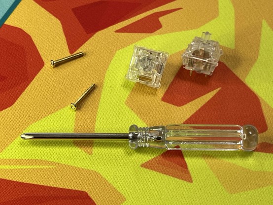
Even the screwdriver is transparent 🤣
The transparent design also means KiiBOOM have nothing to hide and they include a screwdriver in the box, daring you to open it up. They even include a couple of spare screws for those who take them up on the dare. Should you open the KiiBOOM you’ll find the LiPo battery wires rather short, and the cables tricky to remove. After some fumbling – I had cut my nails recently, which didn’t help – I resolved to leave things be and accept that disassembling something I can see through the case might be a fool’s errand.
I did confirm that there are, indeed, two 4000mAh battery packs inside for a whopping total of 8000mAh. That’s a lot of battery, but those LEDs are going to drink it up pretty quickly. Keeping the brightness down can help significantly with lifespan, and you can also skew to darker colours if you’re customising your own. KiiBOOM combat this somewhat by having a very, very short LED idle time.
And on the topic of LEDs…
Illumination Options
It seems I’m already paying for the shots I fired at south-facing LEDs, lack of shine-through keycaps and poor lighting consistency on the keycaps that *do* shine through. KiiBOOM have thrown me a real “hold me beer” curveball by completely inverting the keycaps, making the text the only opaque part. This consequently makes it the most crisp text on a backlit keyboard I’ve seen outside of laptops, with the bonus that it’s also readable in the dark. It’s quite a “have your cake and eat it” moment, so long as you can get over just how much light is beaming up for this thing.
I complained before about RGB LEDs glaring up between keys directly into my eyes, but the acrylic of the KiiBOOM Phantom 98 has a certain amount of refractive effect on the lighting. That’s to say that it never feels like I’m getting the full brunt of the LEDs, though there’s definitely a sweet spot viewing angle where it’s a little harsh. Most of the time I’m reclined back a little in my chair (still rockin’ the Herman Miller Cosm) so my eyeline to the LEDs is blocked. Even sat upright I have to be leaning forward and looking down for it to be a problem.
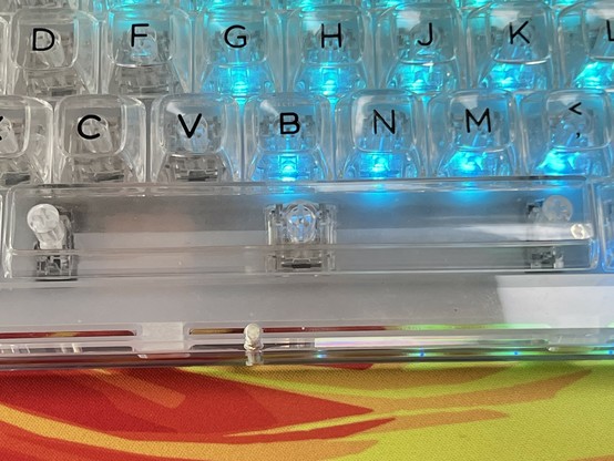
Aw c’mon spacebar needs some proper LED love! #MechanicalKeyboard
And KiiBOOM’s LEDs are bright. Even with the office lights beaming down and daylight steaming in, the lighting effect is bold and striking. Well, at least with the exception of the spacebar- which gets one dinky LED for its entire length. It looks fine side-on because C through M are happy to share, but look top down and there’s a very noticeable void in the lighting. This might be the norm with backlit keyboards, but it’s especially noticeable here.
There’s definitely some inconsistency in the underlighting. This is because the LED elements aren’t diffuse enough to blend the colours and they refract through the case and split into a striped effect. #MechanicalKeyboard
The underglow LEDs aren’t quite as awesome. They cannot be controlled in the (Windows and macOS only) customisation software, and use dome-lensed RGB LEDs with a uniform orientation around the edge of the board. The resulting effect – combined with the refractive and reflective properties of the acrylic – is either a visible striping of colours (rather than a nice blend) around the edge of the keyboard, or simply very visible dots of light as the individual (red, green and blue) LED elements reflect off the inside of the case and become visible from the top.
I’d say the undermounted LEDs are in dire need of a diffuser, but I would also concede that would spoil the gorgeous, clean PCB look. It’d say they need moving in from the edge of the PCB, but with switches in the way there’s not much room for placement. KiiBOOM have done what they could here, and most people aren’t going to notice or care.
The back of the KiiBOOM Phantom 98 lit up is quite something to behold!
All of KiiBOOM’s LEDs seem to be matrix-scanned. In practice this means that, while your eyes see them as always on, the LEDs take it in turns to light up. This effect does not seem to be visible to the naked eye- even with the usual tricks to try and exacerbate it- but I am not super sensitive to LED PWM frequencies and flicker (I guess I’m old, oof) but there might be someone out there who these bother and that might be you, so take that into consideration.
Sound & Feel
I think I’d forgive you for thinking the sheer brazen novelty of the KiiBOOM was just a gimmick that affects the feel and performance of the keyboard itself. That’s very much not the case. The Phantom 98 is an absolute joy to type on, with a muted clickety clackety that’s just present enough to be mechanical but not so obnoxious that your colleagues might have a word or two to say about it.
This is achieved, for the most part, by somehow managing to suspend the keyboard PCB inside a silicone bumper that keeps it somewhat isolated from the acrylic shell and able to flex up and down slightly. This is a common practice in keyboard builds, but KiiBOOM have managed to pull it off while also making it look good through the transparent exterior.
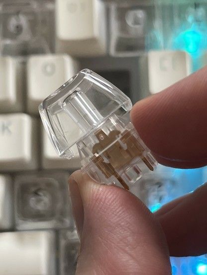
The supplied key switches – KiiBOOM’s “Crystal” switches – are linear with a relatively high actuation force and all of the sound is from them bottoming-out. They feel quite heavy to type on, which could be a dealbreaker for the light fingered among you. On the upside this helps keep the noise level down and avoids accidental keypressed. I think I would prefer something a little lighter. Easier to press, I mean, with all those LEDs shining through you can’t really make these much lighter!
The Knob
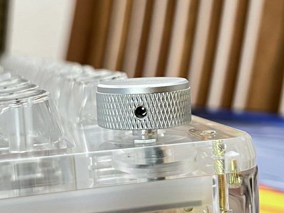
KiiBOOM have given the volume knob the same care and attention as the rest of the design, at least physically anyway. It’s an all-aluminium knob with a comfortable large radius and set just far enough away from other keys to be easy to turn. It’s secured with a worm-screw rather than friction-fit plastic.
That’s one knurled knob!
The knob does feel like it’s skipping steps when I turn it, though, and takes a good couple of turns to go from low to full volume. Turn it too fast and it will, mostly, do nothing. This is an embarrassingly common problem with rotary encoders and it can vary between difficult or easy to solve depending upon how it’s implemented.
Pushing the encoder, by default, will play/pause music. This is an odd choice, since I usually expect it to mute/unmute. The adjacent PgUp and PgDn buttons (these are available on the numpad with Num Lock enabled) could have been Play/Pause and Skip or Stop for a well-rounded media keys setup. Fortunately, assuming you’re on macOS or Windows, this is easy to rectify with the software. Hey KiiBOOM how ‘bout a couple of swap-in keycaps for media functions here?
On the subject of software…
Software & Drivers
I’m going to assume the KiiBOOM is firmware-upgradable, though I don’t know for sure. There’s no newer firmware available on their website and – as far as I can tell – no compelling reason to need one (skippy knob notwithstanding).
While the software – KiiBoom Driver – only works on Windows and macOS, and isn’t a mainstream, open-source configurator like VIA. It is, however, somewhat like VIA and has – in my humble opinion – a slightly more discoverable interface, but a much more limited set of options.
System functions, such as Bluetooth profile select and backlight controls, cannot be rebound at all, and you only get the main layer (as you type normally) and the function layer (when you hold down Fn).
I could, for example, easily rebind the knob to mute/unmute, change PgUp and PgDn to be Play/Pause and Next respectively and then rebind Fn+PgUp and Fn+PgDn back to those previous functions though I’ll never need them.
There are options for binding mouse controls to keys, such as mouse wheel up/down, but these do not repeat when a key is held so in practice turning the “mouse wheel” via keyboard input is an arduous and mostly useless endeavour.
There are, of course, also macros and you can do anything from simple combos of modifier and regular keys – made available via a separate, simpler interface – or record complex macros to run commands or speed through menus.
Changing the backlight is also possible, but due to a very strong bias toward blue it’s really quite difficult to dial in the colours you want. The 16 million colours available via the applications UI will map very, very poorly onto what you actually see on the keyboard and you’ll generally have to both pick darker colours (to avoid everything ending up over-white) and skew slightly redder or greener than you’re aiming to counteract the blue intensity.
Since I’m cursed with The Knowledge of RGB LEDs (We make and sell way too many shiny things at Pimoroni and I have to write the software to make ‘em go blinky) I can pretty confidently assert that KiiBOOM really need some per-channel gamma correction here. They could pair this with 10+bit or more BCM output to compensate for the loss of dynamic range that would entail and get lighting and colours that really pop. Juggling really good lighting control with all the other features a keyboard needs to implement is no walk in the park, though.
Though all the effort in the world to make the RGB lighting perfect will be defeated if you pick up a different colour of KiiBOOM. On anything but clear, the acrylic case will act as a filter and play havoc with your custom colour choices. But hey, trial-and-erroring in that perfect colour theme is all part of the fun, right?
The Inevitable Dirty Downside
As with Apple’s possibly infamous dirt-showcase keyboard, you might quickly find the transparent look becomes a liability if you’re not fastidious about keeping dirt and dust at bay. I’ve already had to pop off key caps and remove some little bits of crud with some ESD tweezers. On a less transparent keyboard I wouldn’t even know the dirt was there. KiiBOOM supply a cleaning cloth, but you might want to keep a clean make-up brush handy for regular dusting.
Any specs of dirt or dust that find their way inside the keyboard- say if you were to try and disassemble it in a less than cleanroom environment – will also be immortalised forever. As delivered the Phantom 98 was pristine, but my efforts to explore inside left a little black speck beneath the ESC key. D’oh!
I appreciate the thought, but this would have maybe been better as a slot in the back of the keyboard…
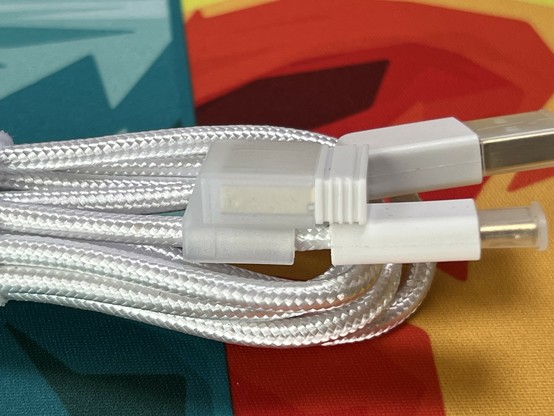
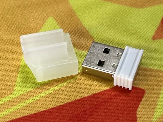
Dirt aside, the transparent design of the KiiBOOM left little room for a 2.4GHz dongle compartment and thus – there isn’t one. There’s a plastic clip supplied, which attaches the dongle to the USB cable (a nice braided USB cable, while I’m mentioning it) but this doesn’t really suffice to keep it safe. The saving grace for KiiBOOM here is that the 98 isn’t exactly portable. If the dongle is anywhere it’s either in the box (you keep your packaging, right?) or plugged into your computer. I, uh, might have left mine on top of the keyboard while I was testing something else and momentarily lost it….
Swapping Keycaps
I picked up some Ranked Pudding keycaps from Amazon, which I did a brief separate review for. I wanted to tone down the look of the KiiBOOM just a little and see if I could capture some of that Apple A1408 keyboard. The TLDR is yes, they actually looked pretty awesome but the V1 set of caps were missing some options to fit the condensed 95%-ish layout. If you’re planning to do this swap with your own KiiBOOM, you’ll need the Ranked Pudding V2.
The switches on the KiiBOOM really like to pull out with the keycaps! 🫠
The KiiBOOM keycaps were fit pretty firmly onto the switches and had a habit of pulling the switch out with them. It was quite tricky to then pull the switch from the cap, but I persevered and got the whole set of caps replaced. Aside from the extremely chaotic compromises I had to make to fit keys to every switch (don’t look too closely!), I think it looks great.
Full view, complete with extremely chaotic mixed profile keys as I tried to find enough to fill out the bottom right edge. The backlight is actually fully on but you can only see a partial view as it scans.
Swapping switches might be a little more loaded, since anything but transparent (like the Crystal switches KiiBOOM supply) is going to completely ruin the look. If you have any strong opinions about typing feel, or prefer a tactile switch, then the KiiBOOM is not for you. Consider the swappable switches a means to replace faulty, worn out or gummed up switches rather than a means to express your preference. That is unless you find switches you’re happy looking at through those transparent key caps, or you swap switches and use pudding caps.
Overall
The KiiBOOM Phantom 98 is an incredible keyboard with one caveat- it’s divisive. If you love it, you’ll love it. Both me and D are huge fans, and she’s all but claimed it for herself. If you hate it you probably didn’t even get this far. And that’s okay! Taste is subjective. I wanted to try the KiiBOOM because I wasn’t sure how I’d feel about it. I did not fully expect to find something with such care and attention put into the details that it’s near impossible not to like.
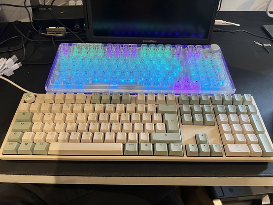
Okay the KiiBOOM only looks big until you put it next to a 100% ducky 🤣 #MechanicalKeyboard
There is another caveat. Software. It’s macOS and Windows only, so us Linux nerds are left in the dark. That said, even macOS support is a bonus. It’s also a little rough around the edges, but it does work and does include some really cool ideas- such as the colour scheme and macro sharing.
The lack of any fancy lighting customisability is a little unfortunate, but I don’t often find myself actually wanting fancy effects (I have work to do, and they’re super distracting). If I can dial in a static teal, or a crystal blue so I can work without any distracting animations in my peripheral vision then that’s fine by me.
With some improvements to the LEDs, a fix to the encoder (knob) missing steps and a couple of alternate key-caps to make the macro and customisation functions feel more integrated the KiiBOOM Phantom 98 could be even better and even more befitting its quite high asking price.
If you like the Phantom 98’s gimmick but you’re on the fence because you’re worried it might compromise the quality of the keyboard- then buy with confidence. It’s just as usable as it is beautiful. If the transparent style doesn’t speak directly to you, then you won’t be missing out by grabbing something “thocky” but opaque.
Main, keep, give away, bin? A solid keep on this one.
