Epomaker CIDOO Nebula 65% Keyboard Reviewed
The CIDOO Nebula was a bit of a wild card. “OMG I want the cute one!” I exclaimed, when I accepted a small bounty of keyboards to test from Epomaker, and they were happy to oblige.
This is it, this is how I work now 🤣
As with my other reviews this keyboard was sent to me for free so I would write about it and maybe say nice things. And I’m going to. Mostly. If you’re looking for another almost 5000 word grilling of Epomaker’s software strategy, then this isn’t the place. If you haven’t read my Epomaker Shadow S review, that will fill you in on everything you need to know about using the VIA configuration software with this keyboard.
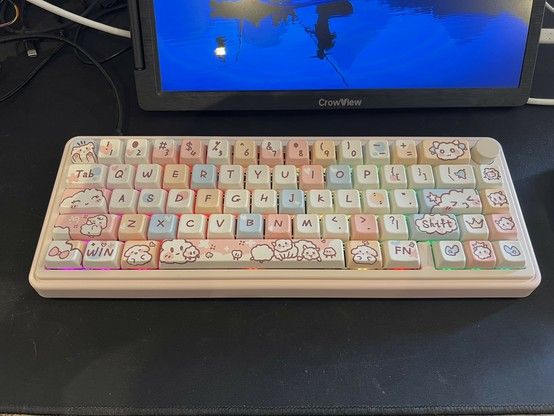
This, then, will be a short review because I basically just want to turn “squeee” into a thousand or so words so it doesn’t look like I just wanted this keyboard just to drool over. Epomaker’s (or is that CIDOO’s?) CIDOO Nebula is yet-another-VIA-compatible-but-totally-not-a-fork-QMK-we-swear keyboard that brings almost distressingly adorable artwork and a beautiful pastel colour scheme into a affordable but cheerful 65% form-factor. It’s good enough to satisfy anyone looking for cutesy but not necessarily the definitive mechanical keyboard experience. And that’s fine!
But don’t let looks fool you. Beneath the CIDOO Nebula’s cutesy appearance hides a functional sleeper. Since it’s cut from the same cloth as Epomaker’s more reserved range, it also has tri-mode Bluetooth, USB and 2.4Ghz wireless which – from my experience testing the Shadow S – works really darn well. From taking apart every other Epomaker keyboard I’ve tested to date, I can hazard an educated guess that the CIDOO Nebula has the same modular design, JST-connected battery, and USB-on-a-daughter-board as its siblings. This means it’s repairable to an extent and pretty nicely put together. Though since it defies any effort to take it apart (I just couldn’t bring a plastic spudger to this one, just in case I messed it up) repairs might fail at the first hurdle.
I tried to find some way to pull the keyboard apart, but after whipping off all the keycaps I was none the wiser. Removed a rubber door from underneath and no screws either. If it’s clipped together plastic then it’s clipped super well!
The main PCB and switch retaining plate are sandwiched together by foam padding which keeps them isolated from the case, dampening the sound somewhat and giving a more yielding typing surface. There’s a very obvious spring when pushing hard anywhere but the extreme edges of the keyboard surface. I like this feel, some might not. I’m very torn over the sound vs feel dichotomy of mechanical keyboard at the moment and haven’t quite decided where I fall.
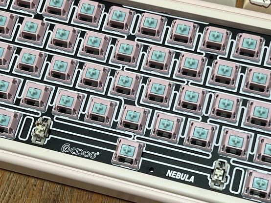
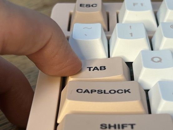
The Nebula’s main weakness is the supplied Carda switches. Most keys lean or wiggle when hit at the extreme edges and aren’t at all stable, this is especially noticeable on Tab and Capslock on the left-hand side or right shift on, y’know, the right. They really lean a lot when pressed at either edge. This isn’t surprising because, despite feeling pretty nice to type on, the Carda switches look super cheap, and are – indeed – among some of the lowest priced in Epomakers range- at $20 for two sets (to fill this board) versus the $34.
I suspect the vast majority of users- attracted by the impeccable kawaii style of this keyboard – are probably not going to notice or care, or even recognise this as a potential issue. But for those that do care, the switches are hot-swappable, so you might want to budget for some slightly superior Sea Salt Silent switches.
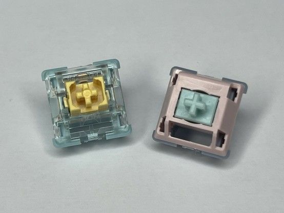
Sea Salt versus Carda switches. The more expensive and clearly better built Sea Salt switch - blue and yellow - is rock stable for regular keys.
I tested Sea Salt in the Shadow-S and they are waaaay more stable. They also dampen the sound a lot, which is rather less audibly satisfying but probably a saving grace for anyone in earshot. I’ll be giving this keyboard to D when I’m done testing it- and I’d like to say I’d do her a full switch swap, but… I’m not sure I can be bothered!
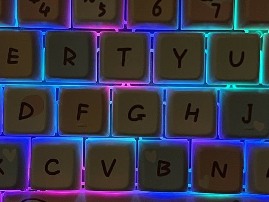
The keys caps are absolutely adorable, in a great selection of pastel colours with a nice hand-written font that’s still legible (to me, anyway, ymmv) and consistent character art across the whole thing. A lot of the special keys are missing text- if you don’t know how to find Ctrl, Alt, Shift, Enter and Backspace by pure muscle memory alone then you might find it a little challenging. On the upside this does make the keys at the extreme right-hand edge – Del, PgUp and PgDn by default – fertile ground for re-binding with VIA since they are just ambiguous cutesy faces.
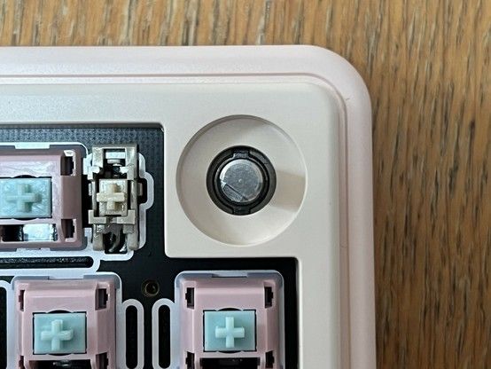
Unlike the damped, spongy keyboard surface the volume knob is held pretty securely.
The knob, which controls volume and mute by default, is very much a nice to have and lends the keyboard a little more character. It doesn’t sit proud of the keys or have much clearance, though, so it requires a little muscle-memory training to roll it around from the outside, top-right edge and avoid fettling Backspace.
The cutesy lettering and a pastel underglow are a heck of a combo!
The RGB LEDs are south-facing and have no diffusion again 🫠 I’d love to see more shine-through keycaps, though I must admit – as I did in the Shadow S review – that underglow effects, especially pastel, are really growing on me. You can control the backlight modes, brightness, saturation and hue entirely via key combos – consult the manual for those – so dialling it back to a pleasing but not in-your-face underglow effect is pretty straight forward. The lighting effect also persists between power cycles and modes so you can more or less set and forget.
As with other Epomaker/CIDOO boards, getting VIA to work required jumping through some hoops- though I strongly suspect many buyers of this keyboard won’t even know or care that this feature exists. I should probably reiterate that Epomaker’s software strategy doesn’t sit well with the wider VIA/QMK and custom keyboard community
Overall? The CIDOO Nebula is squeee as heck. That’s it. I’d buy this as a gift. Yes it’s smol, and although a 65% keyboard is not something I could use full time for programming, it’s certainly fine for writing. If you want to make a good impression, make sure to chuck in a switch upgrade (you’ll need two packs, eek), since the Carda switches are hot garbage.
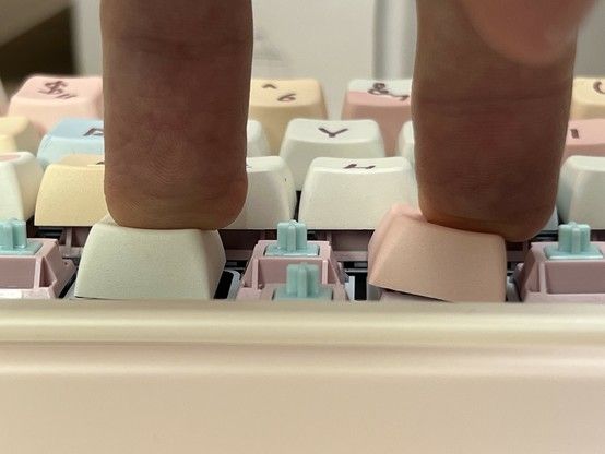
All hail the wobbly tab key. The “Carda” switches in the CIDOO Nebula are a bit naff- hard to see the difference here but the Sea Salt switches in the Shadow S are soooo much more stable.
On my rating scale it’s a Give Away, mostly because D will fight me for it otherwise. Which I guess makes it a Keep, since it’s staying in the house?
