Epomaker Shadow X Keyboard Review
The Shadow X from Epomaker is the first keyboard I’ve tested from the brand, their cute little OLED displays enticed me to reach out to them. It’s a competent keyboard with some interesting features, but can be summed up with one word: disappointing. When I bring a new brand onboard there’s always the temptation to focus on the positives- who doesn’t want to keep getting shiny things, right? But I don’t want to do you – and Epomaker – the disservice of ignoring the things that can, and should, improve.
I tested the Shadow X in Black/Silver with Epomaker’ s “Wysteria” (Linear) switch.
The trouble with the Shadow X isn’t the keyboard. It’s a competently designed, multi-mode, wireless/wired keyboard with all the trappings you’d expect from a mechanical… can I say the word keyboard again? The OLED display is cute, if a little awkwardly placed, and offers some useful-ish headline information about the state of the keyboard. Aesthetically the black/grey version I received to test is very evocative of the late 80s to early 90s – it reminds me of something I can’t quite put my finger on.
The Shadow-X is fully hot-swappable- you can pluck the key caps off and pull out the switches while it’s on and paired to your computer. The board tested came with three spare switches, a puller tool and eight bright yellow alternate key caps- Spacebar, Enter, Backspace, Arrow Keys and ESC.
The trouble is the marketing. Epomaker stretch the truth just a little in a couple of respects- sounding just plausible enough to make me double-check I’m not being silly, but just disingenuous enough to irritate me. Let’s evaluate these complaints first, before I tell you what I like about the Shadow X-
Illumination
Now I recognise that, at time of writing, the word “backlit” or “back-lit” does not appear anywhere in Epomakers Shadow-X product page. I have come to assume that if a keyboard has LEDs they are, ostensibly, for illuminating the symbols on the keys so they can be read in the dark. I’m a hunt-and-peck typist despite over 30 years of computing, and 20+ years of being a “writer” and/or “programmer.” I like backlit keys. Unfortunately the allure of RGB for RGB’s sake means it’s easy for the practical utility to be lost in translation. I’ve complained about most of the backlit keyboards I’ve tested- they all seem to get it wrong in one way or another, and staring at the uniform, even backlighting of my MacBook (or, indeed, pretty much any laptop) really drives home how terrible mech keyboards can be. Epomaker take home the crown for getting backlighting the most wrong, though-
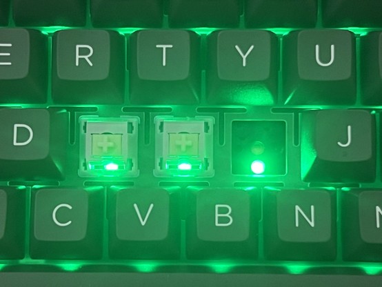
The Epomaker Shadow X’s weird backlighting setup feels very much like they accidentally put the switches upside-down and told marketing to find a way to roll with it. The LEDs shine IN YOUR FACE!
The keys on the Black/Silver Shadow-X are not backlit. In fact the LEDs shine out from underneath the keys directly into your face. Epomaker call these “south facing” LEDs, but surely the whole point is for them to be as under each keycap as possible, illuminating a translucent doubleshot moulded letter. Their product page specifically mentions they “illuminate the key legends and symbols”, but- they don’t? At most they blow out your vision so your eyes cannot pick out the keys in the dark. Even if the letters and symbols were translucent, the “south facing” LEDs would still be in the worst possible position for illuminating them- since rather than shining through the keys, they peek awkwardly out from underneath them and you can – and this is, as far as I’m concerned, backlighting’s greatest sin- see bright LEDs pointing directly at you. I’m sorry but… who would want this? Epomaker… did you accidentally mount your key switches upside-down and try to retrospectively justify that with marketing?
Couple this odd lighting placement with the lack of any diffusers or light-pipes in the hot-swappable switches (little bits of plastic that carry the light from underneath the key, through the hole and – ideally – diffuse it out at the top) and the result is very uneven backlighting that – even when it’s doing something cool – doesn’t look that great. If I’m going to concede that south-facing is at all valid, I’d at least like a diffuse plastic overlay to block line-of-sight on the LEDs and spread the lighting out evenly- unfortunately there just isn’t room.
The Metal Rotary Knob
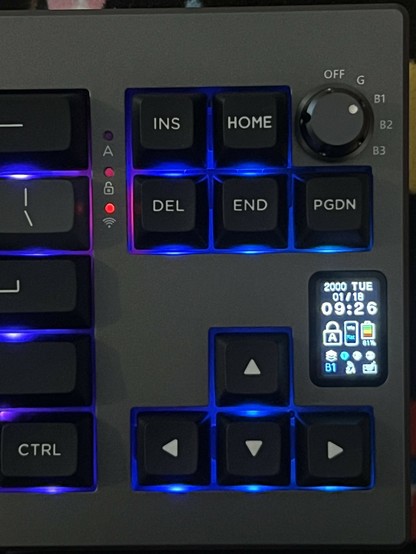
First, it’s not a rotary knob. It is metal, though. Sure, it rotates but when I hear “rotary” I’m expecting a continuously rotating encoder. The knob on the Epomaker Shadow-X is a five position rotary switch. It’s a very nice five position rotary switch, with crisp, decisive action and a satisfying click- but that’s all it is.
The rotary knob, while it isn’t the continually rotating, push button control I’d hope they’d park with the screen, is great for quick switching between paired computers.
It’s a multi-position switch that gives you speedy access to swap between the three bluetooth modes, USB and 2.4 Ghz – it’s advertised as a headline feature, tilted “Metal Rotary Knob” and elaborated with “the knob offers precise control and effortless navigation.” It does neither of these things- well, unless you want only precise control and effortless navigation of the four wireless modes and the wired mode.
This very much feels like a waste of a control on a reprogrammable keyboard, though you might find it useful if you’re looking for an easy-access KVM (or at least K) style setup. This knob should have been a push-button rotary encoder, and it should have given access to the on-keyboard menu (via the OLED display). Here it could easily have allowed things like changing macro layer, adjusting volume, changing LED brightness or effect speed and so much more- if that’s what you were expecting (and I don’t blame you, since the marketing is not clear) then you’re going to be disappointed.
To be fair to Epomaker here, it’s a very elegant solution to a complex problem. Having a five position linear switch (do they even exist?) along the back-edge of the keyboard would be harder to use, harder to see and not nearly as satisfying. The knob serves one purpose and it serves it to an extremely satisfying degree of perfection. If I were regularly switching between a computer on Bluetooth and one on 2.4GHz (or wired) then I would no-doubt find it very, very convenient. Maybe we could get a mode knob and a push-button rotary encoder? Please?
Build Quality
The Epomaker Shadow X feels pretty solid, but it’s made from – for the most part – plastic. It still manages to weigh just slightly over 900g, so perhaps this is for the best. The top and bottom shell – grey/silver and black respectively – are held together with eight visible hex screws which, according to which Wowstick bit fits, are H2.0. If I undo them, the top still resists my best efforts to remove it, but since I’m not doing a teardown (regular switches here, nothing exciting to see inside) I won’t try harder.
The top plastic layer seems a little prone to scuffs around the edges, albeit only small ones. I haven’t been kind to it- throwing it in a backpack as I tote it back and forth between locations. The surface finish gives a pretty close approximation of aluminium, but with a coarser grain. I’m pretty sure it’s paint. Tolerances are generally excellent, with no discernible gaps or flaws in the construction- the OLED is nestled tightly in the top, though the protective window is ever so slightly raised and the alignment between it and the plastic underneath is slightly off.
The stabilisers in the shift key are doing their job, but the switches aren’t super stable on their own so caps lock is a bit wobbly!
The hot-swappable switches are exactly that- you can remove the key caps and then the switches, albeit sometimes the switch will come out with the key cap. I think I prefer this to more difficult to remove switches (I always forget which way around the switch puller is supposed to go). The spacebar, left/right shift, enter and backspace keys all have captive stabiliser bars connected to dummy switches. These work well, and – for example – left shift has much less horizontal slack than capslock. Despite the noise, it feels pretty great to type on.
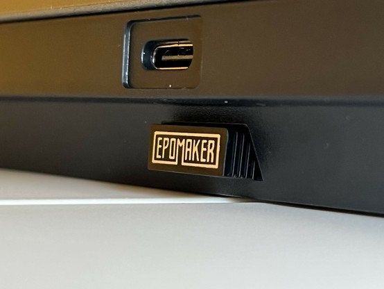
Along the back are the USB type-C port, which is right in the middle with no cable routing options, and a useful little captive (and reassuringly secure) niche for the 2.4GHz dongle.
A neat little place to stow the wireless 2.4GHz dongle!
Underneath are four rubber feet, plus two flip out feet with two stages giving a total of three typing angles. These are plastic, but feel solid enough.
The Software
My board was shipped and tested with firmware IP938_V108 OLEDV107.
I count the little OLED display as part of the Shadow-X’s software stack, since there’s clearly a lot going on in this keyboard to make things happen. From a basic usage perspective it feels fast, responsive and doesn’t cause me any problems while typing (this very review in fact) but the OLED display isn’t all that useful.
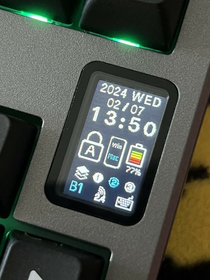
It’s a busy clutter of icons, fonts, styles, line-thicknesses and sizes that gives the impression it was created as a larger graphic and scaled down – poorly – to fit the display. No care has been taken to make it look even slightly polished, and there was clearly no design oversight to keep things consistent. A little over one third of the display is given to the date and time, with the remaining two thirds attempting to communicate battery level, Win/Mac mode, Caps Lock (for some reason), active layer and active mode. The astute among you might notice that caps lock- for which the display reserves a huge padlock icon- already has an indicator LED so this could be removed altogether. You might even notice the knob already pretty clearly and unambiguously shows the current keyboard mode making the little “B1”, “24” and “Keyboard” icons quite thoroughly redundant. That’s about one third of the display wasted on junk, and the actual useful features – battery, and current macro layer – could have been given much, much more room to breathe, or even given way to some small hints about how to toggle the various features.
The OLED in the Epomaker Shadow X is cute, but a little lacking in finesse. There’s even a caps lock indicator, mirroring the dedicated LED on the board!?
At first the clock in the top – yes it shows the time – also seems redundant. Why would I want to look down for a duplicate of something in the top right (or bottom) of my computer screen? Well- if you’re partial to The Videogames you’ll know two things- you won’t be able to see your system clock, and you’ll be prone to losing hours as a consequence. Having a clock at a glance during gaming sessions makes it easier to determine if you’ve got the time for just one more round.
Setting the clock is a bit of a dance, though, you must install the Epomaker Shadow-X driver (which is available for macOS and Windows, but not Linux), then open the app, navigate to Screen – Other Setting, and hit “Synchronize Time on Screen.” Yes, this is a manual action, and you won’t be prompted by the software to fix an out of sync clock.
In addition to setting some basic configuration settings and – as you might imagine – adjusting the LEDs – you can even download shared patterns – the Epomaker “EPOMAKER Drive” software includes the ability to remap key functions, assign macros and all the fun stuff you might expect from a mech keyboard. I’m largely boring in this respect, however, and suffice only to map Fn + , and Fn + . to give me ` and ~ respectively (which are Fn + Esc and Fn + Shift + Esc but I can never remember that).
The keyboard takes about 2 seconds to switch between 2.4GHz and Bluetooth on my MacBook. Most of this seems to be the time taken for the keyboard to start up.
Key Feel & Sound
The linear “Wysteria” switches supplied with Shadow X are “silent”, but since they have very little actuation force, and nothing stopping them bottoming out, the actual typing experience is loud and clackety in what feels like a very unintentional way (in contrast to deliberately clicky switches). It’s not wholly an unpleasant sound, but the rattle of keys bottoming out is very much a function of how heavily you type and I seem to default to quite heavily. This seems to stand in stark contrast to Epomakers claim that “noise is maximally reduced”. It isn’t. The Endgame Gear KB65HE I have on test at the moment (Gateron KS-37B) with similar-feeling keys is (thanks to a significant amount of damping material) much, much quieter. While this key rattle feels almost in keeping with the early 90s aesthetic of the Shadow X, if you want a quiet keyboard the Shadow X is very much not it.
Overall
The takeaway for Epomaker’s Shadow X is that one word I opened with: disappointing. Its super fast switching between multiple wireless modes, neat nook for the USB dongle, decent build quality and fairly comprehensive set of features are marred by cut corners and bafflingly stupid LED placement (I’m told that “south facing” is a real thing that real people actually want in the real world and… I’m sorry, you’re wrong. Get help.) The OLED screen seems like a cool idea, but it doesn’t offer much practical benefit over just using the RGB backlighting to highlight which keys to press in a given situation. The screen is cluttered, disorganised and disjointed with too many redundant elements competing for attention. With no dedicated controls for navigating the keyboard via the OLED (c’mon, rotary encoder please!) it serves mostly as an afterthought. Some design oversight would be great here- and it’s not too late for Epomaker to fix at least this with a firmware update. The only way to fix the lighting is to turn it off, though, sadly.
Despite these complaints, the keyboard itself isn’t terrible – if Epomaker take my criticism as constructive – they aren’t far off from having something really great. Despite the knob feeling a little underwhelming, it does serve its one purpose super well, and is satisfying to clunk between modes. If you’re looking for a wireless board to serve multiple computers – wired, Bluetooth and 2.4GHz – then you’ll find this quick, convenient switch very, very handy. Assuming, of course, that you don’t mind the loud rattle of the keys. The price is certainly right, with the Shadow X being available at around £85 from Amazon or available direct from Epomaker for $77 (careful with VAT, though). In summary, a fancy knob is just not enough to redeem this keyboard and I can’t recommend it.


