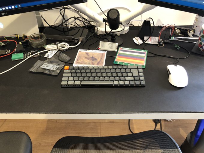
Keychron K7 Slim Mechanical Keyboard Review
With my tendency to tinker on the Steam Deck I quickly found myself in dire need of a decent typing companion for my dinky gaming handheld. Absurd, I know, but the on-screen keyboard in Steam Deck’s “Desktop Mode” is an unmitigated disaster, and I’d already found myself deep in the weeds of Konsole, hacking on game install scripts and more.
A quick ask – and look – around for a diminutive Bluetooth keyboard yielded Keychron who, by pure chance, had recently launched the UK-layout K7. I was smitten by the clean looks and compact design, and snatched one up almost immediately. As such this is one of the few shiny tech gadgets I have purchased with my own money and this review may be coloured by efforts to delude myself into thinking I made a good purchase. Or it might just be a good product!
Really enjoying this uh… Steam Deck stand @ZodiusInfuser ? pic.twitter.com/Oj7vmcBJFQ
— Phil Howard (@Gadgetoid) June 29, 2022
I ordered directly from Keychron’s “UK” website which ships from Hong Kong using the popular 4PX courier service, handing off to Yodel when it reaches the UK. Tracking was a bit touch-and-go at first, but once it hit Yodel’s service I had an estimated delivery day- roughly a week after my order- and it even arrived a day earlier than projected. Delivery was surprisingly smooth, albeit shipping cost slightly upwards of #12 which was a hard pill to swallow. I would certainly recommend waiting for a more local supplier.
Not the best print quality on the back but I’m easily swayed by the shiny front! pic.twitter.com/g6TV6xDWC4
— Phil Howard (@Gadgetoid) June 29, 2022
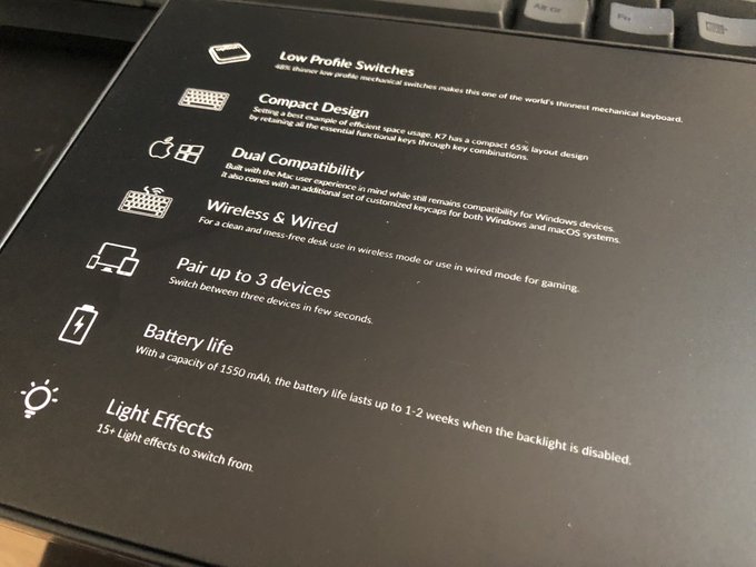
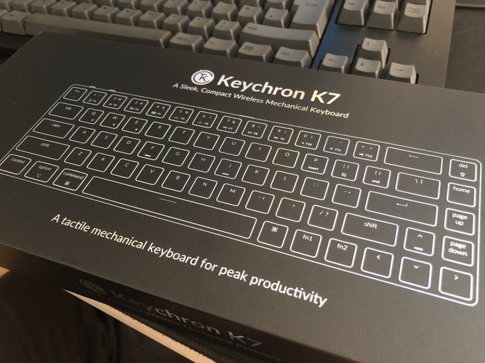
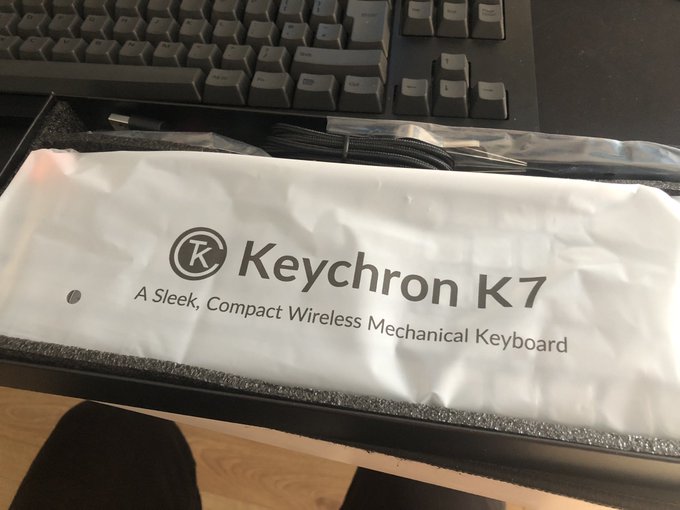
First impressions are everything, and Keychron have not failed to impress with the K7. The packaging is as compact as the keyboard itself affording just enough protection to the – actually quite sturdy- board inside without being oversized and wasteful. The box had a glorious (I’m a sucker for shiny things) holographic style line-art image of the keyboard on the front, and some comparatively rough printed details on the back. The whole thing came sealed in plastic for freshness, though sadly Keychron’s out-of-the-box olfactory design isn’t quite on a par with Apple, or the delectable Steam Deck fan exhaust smell. If you know you know.
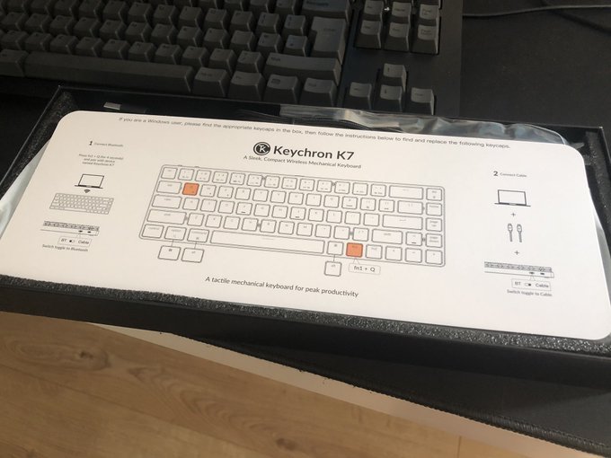
Nice clear documentation right off the bat! pic.twitter.com/QM1NMazzbY
— Phil Howard (@Gadgetoid) June 29, 2022
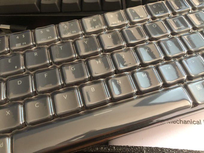
Upon opening I was greeted with a clear and direct documentation sheet laid over the top, detailing the basics of how to turn the K7 on, get paired via Bluetooth and- if necessary- replace the default macOS keycaps with their corresponding Windows counterparts. Underneath this is the keyboard itself, wrapped in a plastic bag and protected on top by a hard plastic bubble that fits over the keys.
Pretty minimal packing. A little lacking in panache here. Keys are well protected though! pic.twitter.com/oz6q3r4wsf
— Phil Howard (@Gadgetoid) June 29, 2022
The bag of swappable key-caps was tempting, but with over thirty years of poking at many different keyboards I skipped the keycaps and set about pairing and testing the noise level of the low-profile brown switches. That’s not to say I’m not extremely interested in seeing what alternate sets Keycron rolls out for this beautiful object, and trying some alternate switc…. oh no, mech keyboards are a slippery slope!
Pairing is easy enough, the K7 supports three Bluetooth hosts switched via fn1 in concert with the Q, W and E keys. A 4-second hold of fn1 + Q (or W, or E for your other profiles) will enter pairing mode. The board shows up as Keychron K7 in the Bluetooth menu of your device and pairing doesn’t require entering a pin. I paired it to my Linux laptop (it’s set up as a desktop, I’m not completely mad!) and the POCO X4 Android phone I’ve been wielding. In fact at this very moment I am typing this review on the POCO X4 right into Google Docs, using the K7.
Typing took a couple of failed attempts to re-adjust my fingers to the key spacing, but in a few short moments I found myself up to speed and quickly noticed a few things:
– The low-profile brown switches on the K7 are quiet, much quieter than the full-sized Cherry switches on my DasKeyboard 4C TKL. If you like the look of the K7 but have trouble with the noise levels of mechanical keyboards you might actually find this usable.
– The keys feel.. good? Soft? Silky? Dry? I can’t really- ahem- put a finger on it but the plastic of the K7 has a very soft feel that I … think… I like.
The compact design puts “del” just to the right of “Backspace” which is going to take some getting used to. The addition of Home, Page Up and Page Down is actually quite useful but we’ll come back to those in a moment…
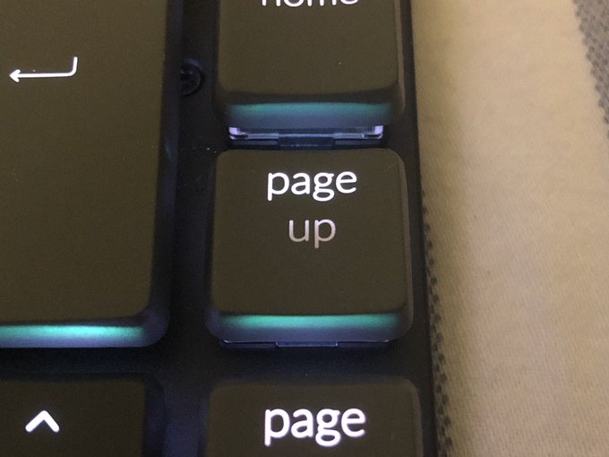
Or.. right now? Strangely enough the “Page Up” and “Page Down” keys only really have the word “page” fully backlit. The “Down” and “Up” sit right over the key post and the backlight shines through the top of the switch so it doesn’t quite diffuse across the key. Turning up the brightness doesn’t really help. It feels like Keychron missed a trick by not using “pg up” and “pg down” here. Since most other labels more or less line up with the backlight this would have handily hidden the issue.
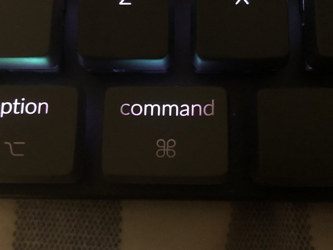
The only other key suffering from a lack of backlight diffusion in the macOS set is “command.” Using the shorter “cmd” would have hidden the fact the middle of the word has a bright spot. “Control” is kind-of on the edge, but is generally fine. This is really nit-picky, but what am I doing if not pointing out room for improvement? Keychron could definitely up their backlighting game here, though I suspect it would require a thorough top to bottom redesign of the whole keyboard to pull off effectively. An LED right under the middle of the switch, guided through a light-pipe to the keycap would be a potential yet expensive fix. Right now the LEDs splash feebly on the underside of each key and whatever light makes it through is a bonus. It feels like, and probably is, a bit of an afterthought and as someone who- yes I’m a bit hunt-and-peck- makes liberal use of keyboard backlighting in low-light (I bought this to tinker with my Steam Deck in the wee hours, remember) I’d appreciate something a bit more laptop-like in execution. Less bleed, more consistent illumination.
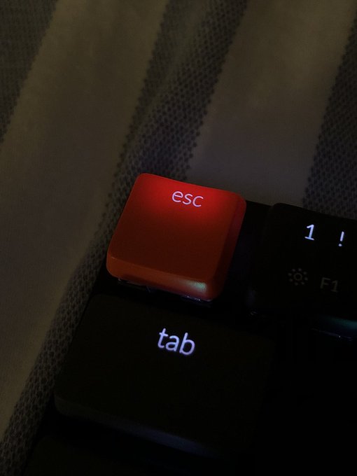
It doesn’t really bother me, but the @KeychronMK K7’s backlight game is absolutely weaksauce. It’s a hard problem to solve effectively and the switches are designed to be good and not pretty, but there’s so much room for improvement here. pic.twitter.com/TIyE1u3UA6
— Phil Howard (@Gadgetoid) June 29, 2022
Backlight aside, the “Home” key seems to miss a trick by not having “End” as a fn-shifted alternate. No permutation of fn or modifier keys seems to coax “Home” into acting as “End” which seems like a weird oversight when so many other keys – including the whole number row, which double as F-keys – are overloaded. “End” is, instead, on “]” (just left of Enter) which I guess is fine. I’m sure the people who design and build keyboards on a regular basis probably have better reasons than my limited imagination can surmise. Perhaps I’m just clutching for something bad to say, so that I might ground the unyielding praise that follows in some kind of believability.
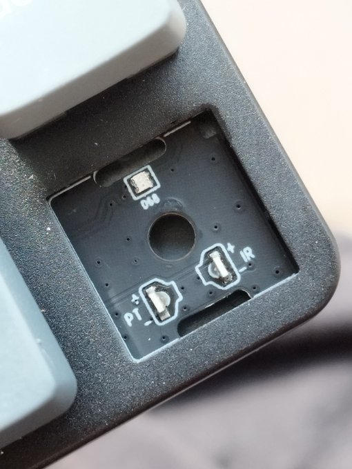
The fact of the matter is that the K7 is really quite good. I picked up the version with swappable optical switches. Can’t wear out beams of light *taps forehead*. Against my better judgement I also picked RGB illumination.
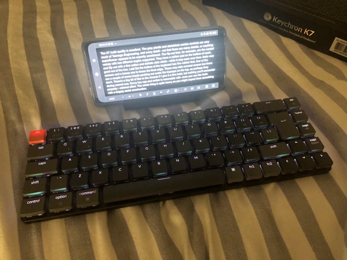
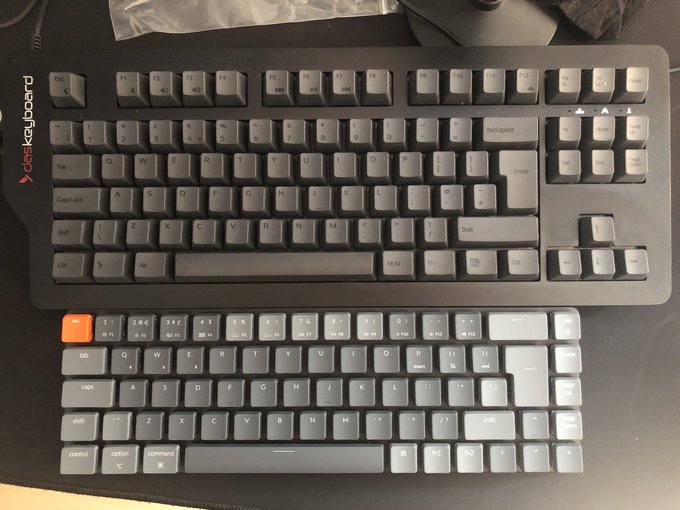
Gosh darn it’s compact! pic.twitter.com/TVjwfhPlTc
— Phil Howard (@Gadgetoid) June 29, 2022
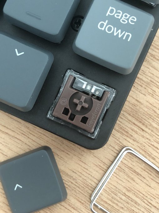
I opted for brown switches since I’ve never felt like I needed pronounced tactile feedback. They’re what I’m more or less used to on the DasKeyboard 4C TKL I tested a few months ago and have been using liberally since. Well, almost. The low-profile switches in the K7 are in a class of their own. They are considerably quieter than the (I’m going to say Cherry) brown switches in the 4C. Despite their reduced size they still have a considerable travel and a defined activation bump that makes this tiny keyboard reassuringly comfortable and responsive to type on.
As an aside, if you’re not familiar with the different colour classes of switch for mechanical keyboards and feel a bit lost here… don’t worry, so do I. Most normies are going to want the quieter brown switches or, perhaps, Keycron’s “Mint” or “Banana” variations on these. These are good all-rounders but lack the defined, tactile “click” that many mech aficionados seem to prefer. I, dear reader, do not care for click, or really have any particular preference of key feel. In fact I’ll level with you, I only want the mint switches because they’re flippin’ mint coloured.
The keys sit a good 8mm or so from the surface of the keyboard which yields a rather liberal amount of what you might call backlight bleed. This is unfortunate, but I think it’s also relatively par for the course with illuminated mech keyboards. Additionally alt functions on the key caps are not illuminated (something that bugged me about the Razer Blade keyboard IIRC) so you’re going to have to memorise where those are if you’re typing in the dark often. Again if “End” were an alternate function of the “Home” key that would be much easier to remember! Oh gosh I’m talking about backlighting again, sorry… onward!
Ooooh would you look at that switch! pic.twitter.com/dxb0U0f9h1
— Phil Howard (@Gadgetoid) June 29, 2022
The keys feel, as I mentioned above, pretty good. I would go so far as calling the feel premium but the fact of the matter is that I haven’t used all that many pricy mech keyboards so I’m not entirely qualified to say. Keychron have designed to pick the “esc” key out in a vibrant orange (matching the power and Bluetooth mode switches on the back edge) which isn’t my favourite colour (and has some weird interactions with the RGB illumination) but is actually rather appealing. The rest of the keys are split between two shades of grey, with the lighter shade picking out an apparently random but possibly relevant set of keys which for the most part comprise non-letter functions and also numbers 5 through 9. The overall effect is a keyboard which looks very, very grown up while still having a little style to tell the casual onlooker that it’s more than meets the eye. Suffice to say it’s absolutely everything that Keychron’s alluring product photography promises, and I dare say a little bit more. I am smitten with this aesthetic, retro-esque, functional piece of art and can see why Keychron came so highly recommended.
The rear toggle switches, picked out in orange, allow switching between Windows/Android and macOS/iOS modes and Bluetooth/Off/Cabled mode. Unsurprisingly, the K7 works beautifully well with the Android phone I’m still typing this review on. This includes functions such as volume and brightness which presumably comes as no surprise to a seasoned Android keyboard user.
Speaking of Android, I was unable to find a comprehensive list of keyboard shortcuts, which is enormously frustrating because there seem to be some very useful and very hidden ones out there. For example POCO X4 I’m using a combination of Option and ”[“ or “]” will activate split view. This might be useful had I anything I needed to reference, but it’s good to know it’s possible nonetheless. (I’d stick twitter up on one side of my phone, but it has so much unnecessary garbage in the UI now I could only read half a tweet.)
Joining the toggle switches along the back-edge is what seems to be a hole for a reset pin (there’s also a factory reset key combo), and a very welcome USB Type-C connector.
Switching away from my Android phone and over to spending a day with the Keychron K7 for productivity reveals a couple of minor issues that may take some getting used to. As a programmer by day and sometimes also night I tend to use backticks often for sharing code pastes- that’s the little ` mark that, in Markdown, denotes a snippet of code when used singly and a block of code when used in triplicate. The backtick key is fn1 + Esc which was not immediately obvious from the key labelling. Keychron supply a table of K7 Key Combinations which you can look up these more esoteric combinations in, but they should really be self-evident from the keyboard labelling itself. Another tricksy shortcut is fn1 + [ for taking a screenshot, available only in the Windows mode of the keyboard (macOS uses some key combo I have long forgotten). This must trigger Print Screen since it works fine in Pop! OS (Linux) too. The fact I haven’t swapped out the key caps for their Windows equivalents has also, unsurprisingly, confused me on a couple of occasions.
E-ink everywhere again, I swear these things are breeding! pic.twitter.com/2i8IjnD7vr
— Phil Howard (@Gadgetoid) June 30, 2022
I used the K7 exclusively over Bluetooth in all these tests, and found latency to be noticeable albeit certainly not bad. Switching to USB definitely improved this, as you would rightly expect. I don’t tend to use Bluetooth keyboards on my desk since – if they’re not going anywhere – they might as well be wired to forego the hassle of batteries and wireless connections. The K7 fared well, however, taking a few moments to wake up when I left my desk, but otherwise feeling rock solid throughout the day. The battery level can be checked with fn1 + B but this is a beta feature that’s not only not accurate but not very granular- it uses Red, Blue or Green to indicate 0-30%, 30-70% and 70-100% ranges respectively, which isn’t all that useful. An at-a-glance LED battery indicator would have been welcome.
The K7 build quality is excellent. The grey plastic and aluminium combo reminds me very much of Teenage Engineering, and every detail – not that there are many details, or anything superfluous- appears to be expertly considered. The flip-out feet, for example, are the nested variety with two different angles supported. They have a rubber pad on the bottom of each, and flip out with a firm action and definite click which – while it may wear over time – feels very good out of the box. Laid flat the bottom of the keyboard has five rubber feet, four at the corners and a bonus one to brace the front edge. These may also conceal screws but there are a couple of screw heads peeking out under the keycaps on the top, so perhaps they don’t (Spoiler: The K7 disassembly guide shows all the screws up top). There’s a tiny bit of flex in the chassis if I give it a firm twist, but nothing you’ll encounter during normal use. Every key cap and switch is removable with- once you use the tools properly – minimal effort. The whole thing is quite heavy as you might expect from something with a largely metal construction.
A little on the disappointing side is the pack-in cable. You only get USB Type-C to USB Type-A so if you’re using the K7 with a laptop or other device that’s only equipped with USB Type-C ports you’ll need to grab another cable. I’m happy to report that the first USB Type-C to USB Type-C cable I grabbed from my desk (they tend to hang around) worked absolutely fine. There’s nothing special you need to look out for generally, just avoid accidentally using a power-only one!
The keys do ride pretty high from the surface of the board and pretty far apart. I’m relatively new to customisable mech keyboards so I don’t really know if this is a good or bad thing. But I can experiment. A quick swap of a key from my 4C TKL reveals that a standard size? Keycap *just* fits onto the K7 and bottoms out if it’s pressed firmly. These larger key-caps also sit closer together, revealing that the spacing of the K7 is intentional to maximise compatibility with swappable parts. That said, the spacebar from the 4C TKL does not fit on the K7. I’m not afraid to say I’d love a condensed K7 that sacrifices this compatibility for an even more compact design. I’m thinking PSION Series 5, here.
Keychron supply a “K7 Keyboard Plate File” which believe can be used to produce a custom overlay to style up the keyboard surface. Unfortunately it’s… a jpeg? I’d love an .svg I could bung through our laser cutter so I could dampen some of that backlight bleed and add a personal touch with vibrant 2mm perspex. The “plate file” is also mirrored left to right. What’s the deal with that, what’s it for? EDIT: They’ve since included DWG files for the optical and regular switch versions! (Or I was silly and missed them before!)
The included tools are the gateway to a world of keyboard customisation. Swappable key-caps and switches will surely be my downfall, though I am entirely happy with the choices I made and even – though you might not believe it – with the RGB backlight. The little multicoloured startup illumination flourish the K7 makes when it’s turned on really clinched this, even though most of the time I’ll just use a single, static colour of illumination to avoid distracting movement in the corner of my eye.
Keychron (at least their .uk site) don’t sell any fancy dye sublimation colourful alternate keycap sets for the K7 yet. These will, hopefully, come in time?
There’s no desktop companion software to configure the keyboard or backlight, this may be a dealbreaker for some but I consider it a win for a portable keyboard. The backlight is entirely controlled by the keyboard itself, and you get a selection of different patterns and effects to choose from, ranging from static colours to animations and responsive effects emanating out from the keys you press. Pretty cool. Utterly superfluous. Keychron recommends Karabiner to remap keys on macOS and SharpKeys on Windows. They also have a “Keychron Linux Group” on Facebook, I don’t know what anyone under the age of 60 is supposed to do with that information.
Overall the K7 is just a hair shy of perfection. It looks beautiful from every angle. Every detail is carefully considered. The colour scheme is deeply evocative of a vintage mechanical keyboard without borrowing too heavily, or being- how can I put it- a ghastly beige. That the K7 manages to exude a distinct personality with so few visual details is nothing short of magic. “Make one key orange” really has some mileage. It looks good. It feels good. It’s built good. And- in retrospect- it’s priced good. Obscene delivery charge notwithstanding.
