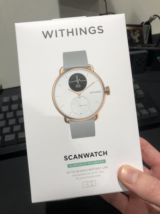
Withings ScanWatch Reviewed
I’ve held a keen interest in their products since picking up the Body+ scales, back when Withings was still under the Nokia umbrella. The scales are great, by the way, but today I’m talking about the ScanWatch.
Withings kindly sent one for me to try with the suggestion that it would make for a great Mother’s Day gift. And you know what? They’re right. Granted my mother stubbornly observes Canadian Mother’s Day and calls the British one “Mothering Sunday”. Hi mum!
Newest shiny across my desk- the @Withings Scan Watch. I’ve been a fan since we bought their Body+ scales- but until now they have eluded my puppy eyes ?
What finally broke them? A looming Mother’s Day! pic.twitter.com/QVlNtd0YOX
— Phil Howard (@Gadgetoid) February 23, 2022
Still, Mother’s Day is an excellent opportunity for those of us who need a little prodding to pick up the phone to take a hint and give some extra care and attention to the mothers in our lives. They don’t have to be our own- I’ve lost one parent, I know how contentious these celebrations can be- but could just as easily be the mothers of our children or that bad-mutha who rides a speed unlocked, Harley-styled mobility scooter down the pavement. Uhh, where was I?
Anyway my point is that ScanWatch at face value – ho ho – looks like an excellent gift. But is it any good? Strap in and find out.
Spoiler: Yes. Yes it is.
Let’s Face It. It Looks Good.
Fitness trackers are an odd breed. My all-time favourite is the Nike Fuel Band for its minimal looks and quirky style. Most seem to focus very heavily on an ultra-modern aesthetic. Black. Bland. Ridiculous amounts of screen. Lots of opportunity to get lost in numbers, and even more opportunity to squander battery life. The biggest and roundest and most watch-like of the bunch still look like fitness trackers and they all seem to miss one glaring, enormous elephant in the room: people wear watches as an appealing fashion accessory.
Google “fitness trackers” and find me more than one that doesn’t look like garbage? You’ve scrolled down to the ScanWatch, haven’t you. Oh you haven’t? Well move along, I’m trying to make a point here!
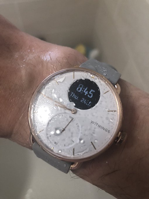
I’m not under 50m of water, but… splash proofness confirmed? pic.twitter.com/9tmPGFUS4c
— Phil Howard (@Gadgetoid) February 24, 2022
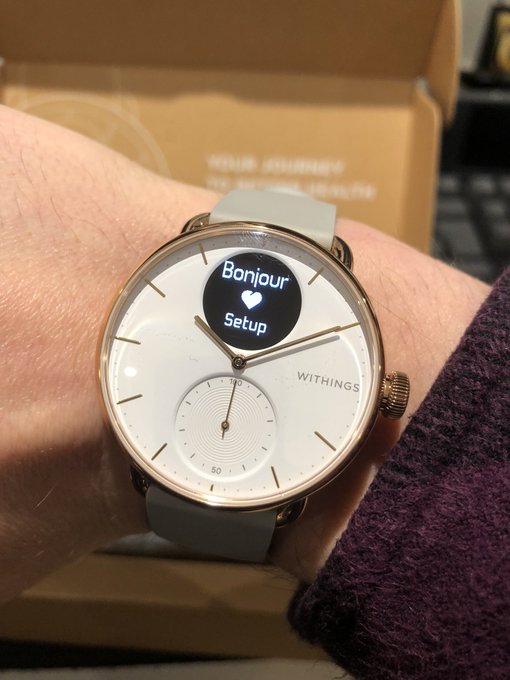
The point is- ScanWatch adopts the classic aesthetic of an analog watch and adds only the bare essentials to turn it into something befitting a fitness tracker. The result is a strikingly attractive and timeless time telling device that stands apart from the ranks upon ranks of black-OLED–you-strap-to-your-wrist boredom. Indeed most classic fitness trackers are built around their screen. ScanWatch is, first and foremost, a watch. The relatively tiny – checks notes – PMOLED screen is embedded into the face as a complication, secondary to the traditional analogue stylings. Joining this tiny screen is a second, analog, complication that serves as a barometer not for pressure, but to show how you’re measuring up against your daily steps goal. One full rotation of the hand is 100% and – much like a clock face – you can tell if you’ve hit 25%, 50% and 75% completion at a glance.
To be fair, the tiny face of the PMOLED does count against ScanWatch for a couple of reasons. First and foremost it’s not exactly big, bold and visible for anyone with a visual impairment. Here, I’m sure, the ranks upon ranks of fat-faced all-screen, all-digital fitness trackers are a safer bet. Second, on a rose gold, white-faced watch (the style tested) it sticks out. The bold, featureless black circle mars the otherwise beautifully clean look of the watch when it’s not in use. Withings call this setup a “hybrid smart-watch” but I think display technology has let them down and I could imagine a designer envisioning a much subtler, more integrated complication. This is what I always loved about Fuel Band- when it’s turned off, the display is effectively invisible.
Well I guess enabling notifications from the Reminders app and setting reminders there works pretty well so why reinvent the wheel! pic.twitter.com/Gtd4GLPabE
— Phil Howard (@Gadgetoid) February 24, 2022
The classic stylings of Scan Watch’s faced are joined by a smart, quick-release wrist-strap-
Strap In!
The ScanWatch’s straps use a little squeeze to release, tool-free mechanism to make them easy to remove and replace. The basic, grey silicone strap supplied offsets the rose gold and white watch face quite effectively, it has 14 holes for adjustment and fits my tiny wrist well. Getting the right amount of tightness takes some trial and error, but I found positioning along my wrist was more likely to adversely affect heart-rate, pulse-oximeter and ECG readings than the tightness of the watch. Don’t feel like you need to clamp it down to your wrist for the fancy stuff to work.
I can’t help but eyeball Withing’s rose gold Milanese wristband. At £50 (or less) it’s roughly half the price of Apple’s Milanese Loop. Indeed prices are good across the range of first party straps available for ScanWatch, though while they have recycled woven PET as an option they’re missing anything I find particularly colourful or exciting.
The low cost of ScanWatch’s supplied strap is evident in the look and feel, though, with the most obvious giveaway being the flashing along the edge of the little loop that holds excess band. For someone with small wrists – like me, somehow – it has a lot of extra strap. Since I’m not used to wearing a watch this still feels a little uncomfortable, and I’m sure some kind of elastic strap would suit me better. Withing’s dedication to traditional watch stylings let them down here, though, there aren’t many non-traditional strap options.
Controls & Feedback
It’s worth stating the obvious here- you’re going to need a smartphone to get any use out of this watch. I tested with an iPhone on which I ran the companion Health Mate app- which I already had installed for the Body+ scale.
All interaction with ScanWatch directly is achieved via the crown. It rotates to select functions and pushes in to activate. While it’s disabled by default you can also enable a “raise to wake” feature so you can see the time in the dark, just by lifting the face up to your… face. This also gives you a quick, hands-free glance at the current day and day of the month- you’re expected to remember which month you’re in! (I… don’t always)
A quick push on the crown will summon the digital clock complete with date and time. You can then rotate it to navigate through Pulse, Steps, Distance, Floors Climbed, ECG, SpO2, Workout, Breathe, Clock (alarms and such) and Settings. If you don’t like or use any of these functions you can bust out the app and re-order or remove them to your heart’s content. It’s so quick and easy to spin through the options that you’ll probably never bother, though.
Rotation of the dial is accented by a tiny linear actuator pulse of haptic feedback. It feels really satisfying, almost like you’re turning a real dial and summoning each option with a mechanical thunk. This same haptic feedback is used to indicate when pressing the crown has no effect, and also when a timer elapses or an alarm goes off. It’s difficult to express in words how nice it feels, but Withings have really nailed the haptics here and it has a surprising amount of thunk for such a small device.
Battery
One of the biggest things keeping me from an Apple Watch- other than the price- is the meagre battery life. Sure you get a slew of features, but the responsibility to take off and charge something that’s traditionally worn 24/7 weighs heavy on my mind. I don’t wanna. With sleep tracking to factor in – assuming you want to regularly track your sleep – when is there really time to take off and charge a watch?
ScanWatch is in a different league. The specifications cite an upper limit of 30 days but in practice there are many, many factors that will affect how long it actually lasts. At time of writing I’m sitting at 37% on the 12th day since first charging and firing up the watch. That suggests an overall battery life just shy of 19 days which isn’t far off the 30 day peak. What’s caused this? Well I had enabled notifications, a morning alarm, every regular scan feature I was prompted for and decided to wear the watch 24/7 to track both daytime and nighttime activity. Additionally I have “raise to view” turned on for the digital display, so I’m firing up the tiny OLED when I check the time. This is close to a worst-case, albeit heavy use of notifications will drain your battery quickly (and probably irritate you). If I get two weeks out of a single charge I think I could live with that.
The practical upshot of this longer battery life is that you can travel for short breaks away without having to pack a charger and wall wart (or you can just use a laptop USB port in a pinch).
The App
The ScanWatch really lives and dies by its companion app. This is Health Mate, a fairly comprehensive health dashboard for all of Withing’s devices. I had some prior experience with it from using the Body+ scales, and it’s cool to see this health data nicely intermingled with details from ScanWatch in one easy to browse overview.
For the ScanWatch this includes things like half-hourly breakdowns of your step counts, with little annotations when it thinks you’re cycling (read: pushing a pram) or running (read: chasing a toddler maybe). This is beautifully visually aligned with heartrate data which – if you’re trying to do cardio exercise which I understand involves raising and lowering your heartrate in intervals – is invaluable for seeing just how effective your daily activity might be.
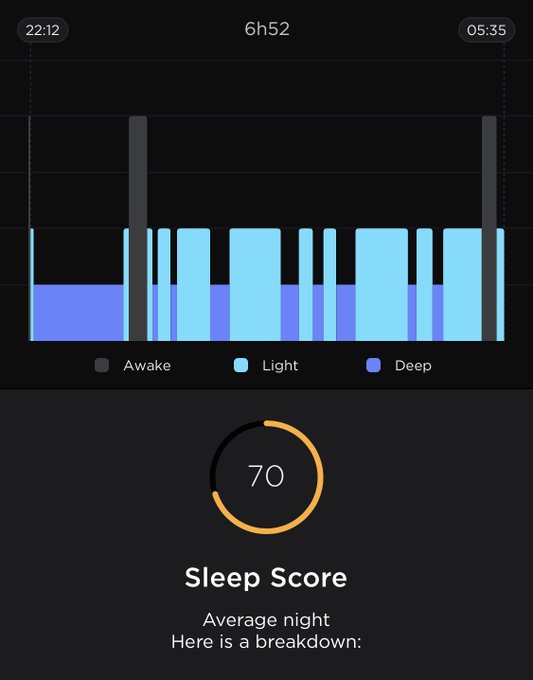
Sleep tracking is also present in-app, albeit it’s not quite as granular as that I’ve seen from competing devices. ScanWatch seems to be able to differentiate between Awake, Light Sleep and Deep/REM sleep, but it’s not always on the money when it comes to telling between Awake and Light sleep. I am near certain that my habit of lying still desperately trying to sleep is misread as actually being asleep, thus skewing my sleep times. Major interruptions, however, appear as great grey obelisks upsetting the sleep chart so it’s easy to pick up where you might have had a sleep-wrecking disturbance.
Any ECG tests you’ve taken can be played back in realtime. This is cool, but broadly useless unless you have some kind of disturbance to show a health professional. The crux of the ECG feature is keeping an eye out for atrial fibrillation, but this is something that I cannot adequately test or verify.
Health data is stored on ScanWatch even if your bluetooth is disabled. I’ve slept with the watch on and turned bluetooth on in the morning to sync the gathered sleep data.
Now I know *why* I feel like garbage! ? pic.twitter.com/VtiCigLjMx
— Phil Howard (@Gadgetoid) February 24, 2022
ECG, SPO2 and some other features can be activated directly on the watch, with the more granular data available in-app. There’s also a “Breathe” feature entirely on the watch which guides you through setting up a controlled breathing session with configurable duration and breaths per minute. It’s actually quite relaxing. The watch will vibrate slightly to indicate when you should breathe in and out, so you can close your eyes. It also shows a ring opening/closing to help visually pace your breathing.
Overall
The ScanWatch is – in my humble opinion – an all-round excellent device. It’s beautifully styled, uncomplicated by the burden of too many smart features, easy to use and lasts long enough to not be a regular nuisance to charge. It’s the sort of device you don’t resent wearing, but not generally interacting with. It serves the basic purpose of telling the time – something I’ve found much more useful than I expected – and tracking health, but doesn’t demand to be an invasive supplement to your phone. As I suspected, it’s a perfect mother’s day gift.
